## Scatter Plot Comparison: Predicted vs. Observed Loss by Model Size
### Overview
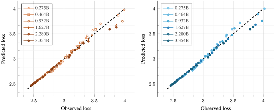
The image displays two side-by-side scatter plots comparing "Predicted loss" (y-axis) against "Observed loss" (x-axis) for various model sizes. Each plot uses a different color palette (orange/brown on the left, blue on the right) but represents the same underlying data series. A dashed diagonal line (y=x) serves as a reference for perfect prediction accuracy. The plots are designed to evaluate how well a predictive model's loss estimates align with actual observed loss values across different model scales.
### Components/Axes
* **Chart Type:** Two scatter plots with a reference line.
* **X-Axis (Both Plots):** Labeled "Observed loss". Scale ranges from approximately 2.5 to 4.0, with major tick marks at 2.5, 3, 3.5, and 4.
* **Y-Axis (Both Plots):** Labeled "Predicted loss". Scale ranges from approximately 2.5 to 4.0, with major tick marks at 2.5, 3, 3.5, and 4.
* **Reference Line:** A black dashed diagonal line runs from the bottom-left corner (2.5, 2.5) to the top-right corner (4.0, 4.0) in both plots, representing perfect prediction (Predicted loss = Observed loss).
* **Legends:** Located in the top-left corner of each plot. Both legends contain the same six entries, each corresponding to a model size (in billions of parameters, denoted by "B") and a unique marker shape/color.
* **Left Plot (Orange/Brown Palette):**
* `0.275B` - Light orange circle
* `0.464B` - Orange square
* `0.932B` - Medium orange diamond
* `1.627B` - Dark orange/brown triangle (pointing up)
* `2.280B` - Dark brown triangle (pointing down)
* `3.354B` - Darkest brown circle
* **Right Plot (Blue Palette):**
* `0.275B` - Light blue circle
* `0.464B` - Medium blue square
* `0.932B` - Blue diamond
* `1.627B` - Dark blue triangle (pointing up)
* `2.280B` - Darker blue triangle (pointing down)
* `3.354B` - Darkest blue circle
### Detailed Analysis
The data points for all model sizes cluster closely around the diagonal reference line, indicating a generally strong correlation between predicted and observed loss. However, the spread and position relative to the line vary by model size.
* **Trend Verification:** For all data series, the general trend is upward sloping, meaning higher observed loss corresponds to higher predicted loss.
* **Data Point Distribution by Model Size:**
* **Smaller Models (0.275B, 0.464B):** Data points are tightly clustered and lie very close to or on the diagonal line across the entire range (observed loss ~2.5 to ~3.8). This suggests highly accurate predictions for these model sizes.
* **Medium Models (0.932B, 1.627B):** Points remain close to the line but begin to show slightly more scatter, particularly at the higher end of the loss scale (observed loss > 3.5).
* **Larger Models (2.280B, 3.354B):** The deviation from the diagonal line becomes more pronounced. While points at lower loss values (~2.5-3.0) are still accurate, points at higher observed loss (> 3.5) show a clear tendency to fall **below** the diagonal line. This indicates that for larger models with high actual loss, the model's predicted loss tends to be **lower** than the observed value (under-prediction).
### Key Observations
1. **Systematic Under-prediction for Large Models:** The most notable pattern is the increasing under-prediction of loss for the largest models (2.280B and 3.354B) as the observed loss increases. This is visible in both color schemes.
2. **Consistency Across Visualizations:** The two plots, using different color palettes, show identical data distributions and trends, confirming the observation is not an artifact of color choice.
3. **Tight Clustering at Low Loss:** All model sizes show excellent prediction accuracy (points on the line) for observed loss values between approximately 2.5 and 3.0.
4. **Increased Variance with Scale:** The vertical spread of points for a given observed loss value appears to increase slightly with model size, suggesting predictions become less precise for larger models.
### Interpretation
This visualization assesses the calibration of a loss prediction model across different scales of a target model (likely a neural network). The data suggests the prediction mechanism is well-calibrated for smaller models and for predictions of lower loss values. However, it reveals a critical limitation: **the predictor systematically underestimates the loss for larger models when the true loss is high.**
This has significant implications. If this predictor is used for resource allocation, early stopping, or model selection, it could lead to over-optimistic assessments of large model performance in high-loss regimes. The cause could be that the predictor's training data lacked sufficient examples of large models with high loss, or that the relationship between model features and loss becomes more complex and non-linear at scale, which the predictor fails to capture. The investigation should focus on the high-loss, large-model quadrant of the plot to improve the predictor's accuracy.