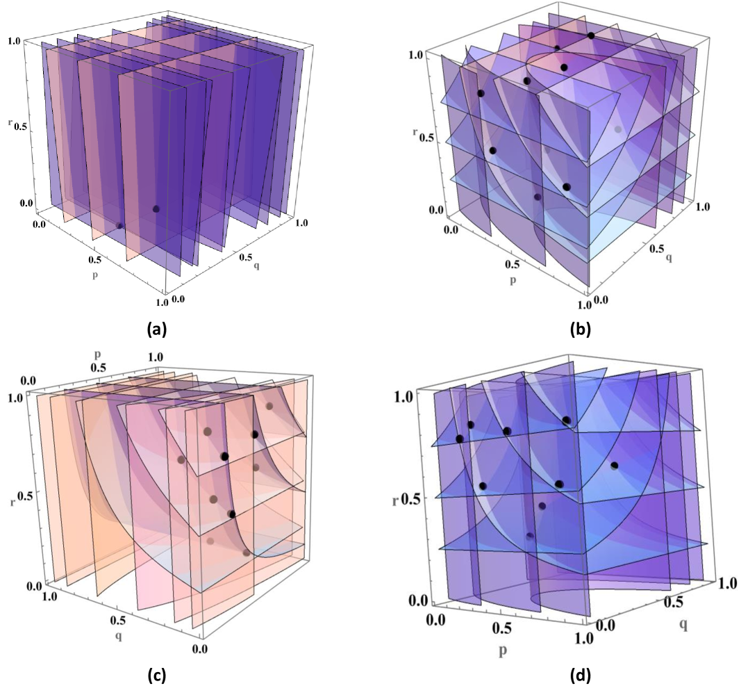
## 3D Scatter Plots with Model Predictions and Data Points
### Overview
The image contains four 3D scatter plots (a-d) visualizing relationships between three variables: p (x-axis), q (y-axis), and r (z-axis). Each plot combines:
- **Black data points** representing observed values
- **Colored planes** representing model predictions
- **Grid lines** for spatial orientation
### Components/Axes
- **Axes Labels**:
- X-axis: p (0.0 to 1.0)
- Y-axis: q (0.0 to 1.0)
- Z-axis: r (0.0 to 1.0)
- **Legends**:
- **Black dots**: Data Points (observed values)
- **Colored planes**: Model Predictions (different colors per plot)
- **Plot Layout**:
- All plots occupy equal quadrants
- Legend positioned top-right in each plot
- Axes labels positioned on respective sides
### Detailed Analysis
#### Plot (a)
- **Color Scheme**: Purple planes with pink edges
- **Data Points**: 2 black dots clustered near (p=0.2, q=0.3, r=0.1)
- **Model Prediction**: Vertical planes at p=0.0, 0.5, 1.0
- **Trend**: Data points deviate significantly from predicted planes
#### Plot (b)
- **Color Scheme**: Purple and blue planes
- **Data Points**: 5 black dots distributed across mid-range values
- **Model Prediction**: Diagonal planes intersecting at (p=0.5, q=0.5, r=0.5)
- **Trend**: Points show moderate alignment with predicted planes
#### Plot (c)
- **Color Scheme**: Pink and blue planes
- **Data Points**: 6 black dots with 3 near (p=0.7, q=0.8, r=0.9)
- **Model Prediction**: Curved planes forming saddle shapes
- **Trend**: Points cluster in upper-right quadrant, away from predictions
#### Plot (d)
- **Color Scheme**: Purple and blue planes
- **Data Points**: 7 black dots with 4 near (p=0.3, q=0.4, r=0.2)
- **Model Prediction**: Planes forming intersecting cones
- **Trend**: Points show mixed alignment with predictions
### Key Observations
1. **Data Distribution**: Points cluster in specific regions rather than uniform distribution
2. **Model Accuracy**:
- Plot (b) shows best alignment between data and predictions
- Plot (a) shows worst alignment
3. **Anomalies**:
- Plot (c) has 3 points deviating >0.3 units from nearest plane
- Plot (d) has 3 points in lower-left quadrant with no predicted plane coverage
### Interpretation
The plots demonstrate model performance across different parameter spaces:
- **Model Limitations**: Vertical planes in (a) suggest oversimplified predictions
- **Context Sensitivity**: Diagonal planes in (b) indicate better handling of mid-range values
- **Nonlinear Relationships**: Curved planes in (c) and cones in (d) attempt to capture complex patterns
- **Data Gaps**: Missing predictions in lower-left quadrant of (d) suggest unmodeled parameter ranges
The visualization highlights the importance of model complexity matching data structure, with simpler models failing in regions of high data variability. The consistent use of black data points across all plots allows direct comparison of prediction accuracy across different modeling approaches.