## Scatter Plot: Data Point Distribution by Association Type
### Overview
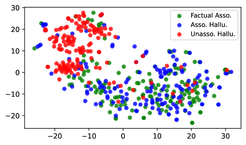
The image is a scatter plot displaying three distinct data series represented by colored points: green (Factual Asso.), blue (Asso. Hallu.), and red (Unasso. Hallu.). The plot spans an x-axis from -20 to 30 and a y-axis from -20 to 30. Data points are distributed across the plane with varying densities and overlaps.
### Components/Axes
- **X-axis**: Labeled with numerical values from -20 to 30, no explicit title provided.
- **Y-axis**: Labeled with numerical values from -20 to 30, no explicit title provided.
- **Legend**: Located in the top-right corner, with three entries:
- **Green**: "Factual Asso."
- **Blue**: "Asso. Hallu."
- **Red**: "Unasso. Hallu."
- **Data Points**: Circular markers with no explicit size or shape variations.
### Detailed Analysis
- **Factual Asso. (Green)**:
- Concentrated in the **top-left quadrant** (x ≈ -20 to 0, y ≈ 10 to 20).
- Some points extend into the **middle-right** (x ≈ 0 to 10, y ≈ 0 to 10).
- Approximate density: ~30-40% of total points.
- **Asso. Hallu. (Blue)**:
- Widely dispersed across the plot, with clusters in:
- **Middle** (x ≈ -10 to 10, y ≈ -10 to 10).
- **Top-right** (x ≈ 10 to 20, y ≈ 10 to 20).
- Approximate density: ~30-40% of total points.
- **Unasso. Hallu. (Red)**:
- Dominant in the **top-right quadrant** (x ≈ 10 to 30, y ≈ 10 to 20).
- Some points overlap with blue in the **middle** (x ≈ 0 to 10, y ≈ 0 to 10).
- Approximate density: ~20-30% of total points.
### Key Observations
1. **Factual Asso. (Green)** shows a clear clustering in the top-left, suggesting a consistent pattern in this category.
2. **Asso. Hallu. (Blue)** exhibits the most variability, with points spread across multiple regions, indicating less consistency.
3. **Unasso. Hallu. (Red)** is predominantly in the top-right, but its overlap with blue in the middle suggests potential ambiguity or shared characteristics.
4. **Overlap**: Significant overlap between blue and red in the middle region (x ≈ 0 to 10, y ≈ 0 to 10), possibly indicating overlapping criteria or misclassification.
5. **Outliers**: A few green points appear in the bottom-left (x ≈ -20 to -10, y ≈ -10 to 0), deviating from the main cluster.
### Interpretation
The data suggests a distinction between **Factual Associations** (green), which are tightly grouped, and **Hallucinations** (blue and red), which are more dispersed. The red points (Unasso. Hallu.) in the top-right may represent instances where unassociated hallucinations exhibit higher values in both axes, while their presence in the middle could indicate overlapping or ambiguous cases. The blue points (Asso. Hallu.) show the greatest variability, possibly reflecting a broader range of associated hallucinations. The overlap between blue and red in the middle region raises questions about classification boundaries or potential errors in data labeling. This distribution highlights the need for further analysis to clarify the criteria distinguishing these categories.