## Bar Chart: Method Preference
### Overview
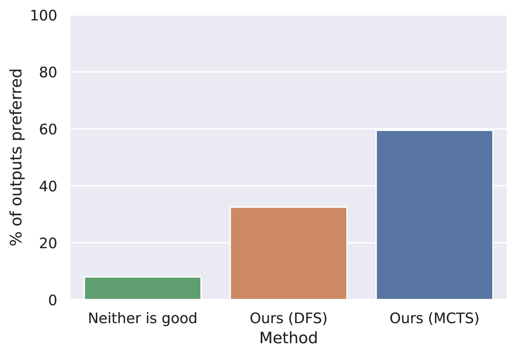
The image is a bar chart comparing the percentage of outputs preferred for three methods: "Neither is good," "Ours (DFS)," and "Ours (MCTS)." The y-axis represents the percentage of outputs preferred, ranging from 0 to 100. The x-axis represents the method used.
### Components/Axes
* **X-axis:** Method. Categories: "Neither is good," "Ours (DFS)," "Ours (MCTS)."
* **Y-axis:** "% of outputs preferred." Scale: 0 to 100, with tick marks at intervals of 20.
### Detailed Analysis
* **Neither is good:** The green bar is at approximately 8%.
* **Ours (DFS):** The brown bar is at approximately 33%.
* **Ours (MCTS):** The blue bar is at approximately 60%.
### Key Observations
The "Ours (MCTS)" method has the highest percentage of preferred outputs, followed by "Ours (DFS)," and then "Neither is good."
### Interpretation
The bar chart suggests that the "Ours (MCTS)" method is the most preferred among the three options, as it has the highest percentage of preferred outputs. "Ours (DFS)" is preferred more often than when neither method produces a good output. This indicates that "Ours (MCTS)" is a better method than "Ours (DFS)", and both are better than when neither is good.