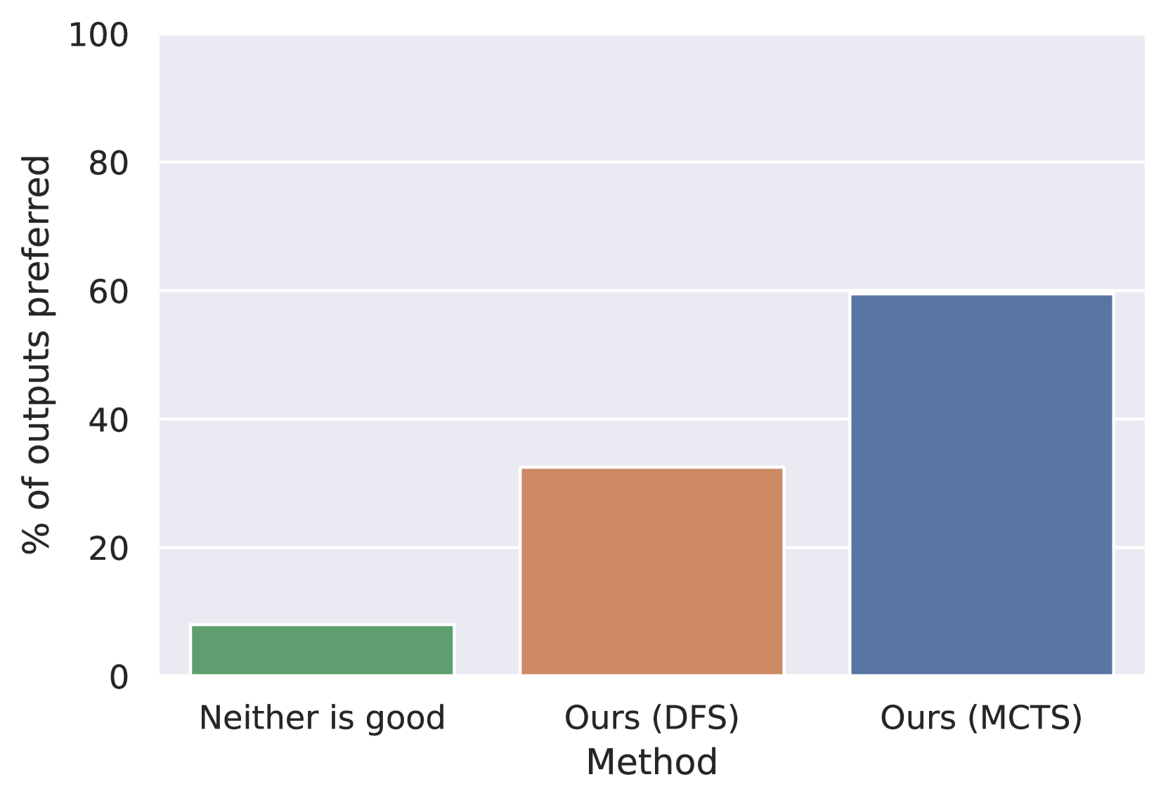
## Bar Chart: Method Preference Evaluation
### Overview
The image displays a vertical bar chart comparing the preference rates for three different outcomes or methods. The chart is presented on a light gray background with white horizontal grid lines for reference. The data suggests a comparative evaluation, likely from a user study or model output assessment.
### Components/Axes
* **Y-Axis (Vertical):**
* **Label:** "% of outputs preferred"
* **Scale:** Linear scale from 0 to 100.
* **Major Tick Marks:** 0, 20, 40, 60, 80, 100.
* **X-Axis (Horizontal):**
* **Label:** "Method"
* **Categories (from left to right):**
1. "Neither is good"
2. "Ours (DFS)"
3. "Ours (MCTS)"
* **Data Series:** Three distinct bars, each corresponding to one of the x-axis categories. There is no separate legend; the category labels are placed directly beneath their respective bars.
### Detailed Analysis
The chart presents the percentage of times each method's output was preferred in a comparative evaluation.
1. **"Neither is good" (Green Bar, Leftmost):**
* **Visual Trend:** This is the shortest bar, indicating the lowest preference rate.
* **Approximate Value:** The top of the bar aligns just below the midpoint between 0 and 20 on the y-axis. Estimated value: **~8%**.
2. **"Ours (DFS)" (Orange Bar, Center):**
* **Visual Trend:** This bar is of medium height, showing a moderate preference rate.
* **Approximate Value:** The top of the bar is clearly above the 20 line and appears to be slightly above the midpoint between 20 and 40. Estimated value: **~32%**.
3. **"Ours (MCTS)" (Blue Bar, Rightmost):**
* **Visual Trend:** This is the tallest bar by a significant margin, indicating the highest preference rate.
* **Approximate Value:** The top of the bar aligns almost exactly with the 60 grid line. Estimated value: **~60%**.
**Spatial Grounding & Verification:** The bars are positioned sequentially along the x-axis. The color-to-label mapping is direct and unambiguous due to the labels being centered under each bar. The blue bar for "Ours (MCTS)" is visually dominant, occupying the rightmost position and reaching the highest point on the y-axis scale.
### Key Observations
* There is a clear, ascending trend in preference from left to right: "Neither is good" < "Ours (DFS)" < "Ours (MCTS)".
* The "Ours (MCTS)" method is preferred nearly twice as often as the "Ours (DFS)" method (60% vs. ~32%).
* The combined preference for the two "Ours" methods (DFS and MCTS) totals approximately 92%, suggesting that in the vast majority of cases, at least one of the proposed methods was preferred over the "Neither is good" option.
* The "Neither is good" outcome represents a small minority of cases (~8%).
### Interpretation
This chart likely presents results from a human evaluation or automated assessment comparing the outputs of two algorithmic methods (labeled "Ours (DFS)" and "Ours (MCTS)") against a baseline or failure case ("Neither is good"). The data strongly suggests that the **MCTS (Monte Carlo Tree Search) variant of the authors' method is significantly more effective or preferred** than their DFS (Depth-First Search) variant in the evaluated context.
The low percentage for "Neither is good" indicates that the evaluation task was generally solvable by at least one of the presented methods. The substantial gap between the DFS and MCTS results implies that the search strategy (MCTS vs. DFS) is a critical factor in the performance of the underlying system. This visualization effectively argues for the superiority of the MCTS approach within the scope of this study.