## Bar Chart: Percentage of Outputs Preferred by Method
### Overview
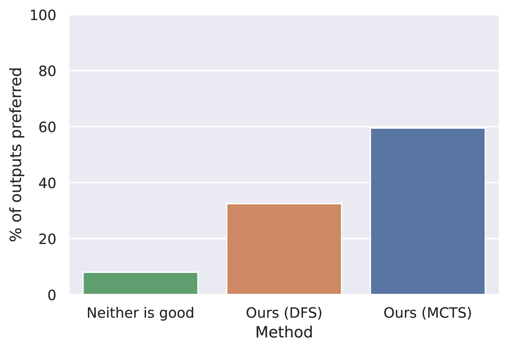
The chart compares three methods ("Neither is good," "Ours (DFS)," and "Ours (MCTS)") based on the percentage of outputs preferred. The y-axis represents preference percentage (0–100%), while the x-axis lists the methods. The "Ours (MCTS)" method dominates, followed by "Ours (DFS)," with "Neither is good" having the lowest preference.
### Components/Axes
- **X-axis (Method)**:
- Categories: "Neither is good" (green), "Ours (DFS)" (orange), "Ours (MCTS)" (blue).
- **Y-axis (% of outputs preferred)**:
- Scale: 0–100% in 20% increments.
- **Legend**:
- Position: Bottom of the chart.
- Colors: Green = "Neither is good," Orange = "Ours (DFS)," Blue = "Ours (MCTS)."
### Detailed Analysis
- **Neither is good (Green)**:
- Height: ~8% of outputs preferred.
- Uncertainty: ±2% (estimated from bar height relative to y-axis grid).
- **Ours (DFS) (Orange)**:
- Height: ~32% of outputs preferred.
- Uncertainty: ±2%.
- **Ours (MCTS) (Blue)**:
- Height: ~60% of outputs preferred.
- Uncertainty: ±2%.
### Key Observations
1. **Dominance of MCTS**: "Ours (MCTS)" is preferred ~60% of the time, significantly outperforming other methods.
2. **DFS vs. Neither**: "Ours (DFS)" is preferred ~32% of the time, ~4x more than "Neither is good."
3. **Low Baseline**: "Neither is good" has the lowest preference, suggesting it is rarely chosen.
### Interpretation
The data demonstrates a clear preference hierarchy: **MCTS > DFS > Neither**. The MCTS method is nearly twice as preferred as DFS, which itself is ~4x more preferred than the "Neither is good" baseline. This suggests MCTS is the most effective method in the evaluated context, while "Neither is good" serves as a weak control group. The stark contrast between MCTS and DFS implies MCTS may offer unique advantages (e.g., accuracy, efficiency) worth investigating further. The chart’s simplicity emphasizes actionable insights over complexity, prioritizing direct comparison of method performance.