\n
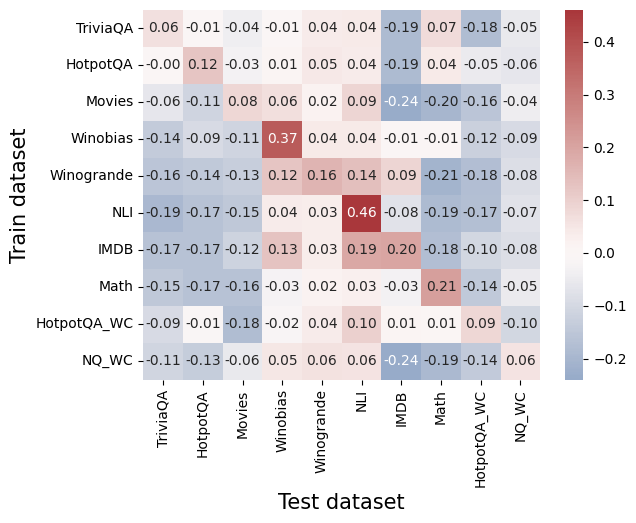
## Heatmap: Correlation Matrix of Dataset Performance
### Overview
The image presents a heatmap visualizing the correlation matrix between different datasets used for training and testing a model. The rows represent the training datasets, and the columns represent the test datasets. The color intensity indicates the correlation coefficient, with red representing positive correlation and blue representing negative correlation. The values within each cell represent the correlation coefficient.
### Components/Axes
* **X-axis (Horizontal):** Test dataset. Categories are: TriviaQA, HotpotQA, Movies, Winobias, Winogrande, NLI, IMDB, Math, HotpotQA\_WC, NQ\_WC.
* **Y-axis (Vertical):** Train dataset. Categories are: TriviaQA, HotpotQA, Movies, Winobias, Winogrande, NLI, IMDB, Math, HotpotQA\_WC, NQ\_WC.
* **Color Scale (Right):** Represents the correlation coefficient, ranging from -0.4 to 0.4.
* Dark Red: ~0.4
* Light Red: ~0.2
* White: ~0.0
* Light Blue: ~-0.1
* Dark Blue: ~-0.2
* **Labels:** Each cell contains a numerical value representing the correlation coefficient between the corresponding train and test datasets.
### Detailed Analysis
The heatmap displays the correlation coefficients between each pair of training and testing datasets. Here's a breakdown of the values, row by row:
* **TriviaQA:** -0.06, -0.01, -0.04, -0.01, 0.04, 0.04, -0.19, 0.07, -0.18, -0.05
* **HotpotQA:** 0.00, 0.12, -0.03, 0.01, 0.05, 0.00, -0.19, 0.04, -0.05, -0.06
* **Movies:** -0.06, -0.11, 0.08, 0.06, 0.02, -0.09, -0.24, -0.20, -0.16, -0.04
* **Winobias:** -0.14, -0.09, -0.11, 0.37, 0.04, 0.03, -0.12, -0.09, -0.12, -0.08
* **Winogrande:** -0.16, -0.14, 0.12, 0.16, 0.14, 0.09, -0.21, -0.18, -0.08
* **NLI:** -0.19, -0.17, -0.15, 0.04, 0.36, -0.08, -0.19, -0.17, -0.07
* **IMDB:** -0.17, -0.17, -0.12, 0.13, 0.03, 0.19, 0.20, -0.18, -0.10, -0.08
* **Math:** -0.15, -0.16, -0.16, -0.03, 0.02, 0.03, -0.21, -0.14, -0.05
* **HotpotQA\_WC:** -0.09, -0.01, -0.18, -0.12, -0.08, 0.01, 0.01, 0.09, -0.09
* **NQ\_WC:** -0.11, -0.13, -0.06, -0.08, 0.06, -0.24, -0.19, -0.14, -0.04
**Trends:**
* The diagonal elements (where train and test datasets are the same) are generally close to zero, indicating weak self-correlation.
* Winobias and NLI show a relatively strong positive correlation (0.37 and 0.36 respectively) when used as training data with themselves as test data.
* Movies and Math consistently exhibit negative correlations with several test datasets.
* The correlations are generally weak, with most values falling between -0.2 and 0.2.
### Key Observations
* The highest positive correlation is between Winobias as train and test data (0.37).
* The most negative correlation is between Movies as train and NLI as test data (-0.24) and between Movies as train and Math as test data (-0.24).
* The correlations are generally low, suggesting that performance on one dataset does not strongly predict performance on another.
### Interpretation
This heatmap reveals the relationships between the performance of a model across different datasets. The low overall correlation suggests that the datasets are relatively independent in terms of the skills or knowledge required to perform well on them. This could be due to differences in the types of questions, the domain of knowledge, or the style of writing.
The strong positive correlation between Winobias and NLI suggests that these datasets share common characteristics, potentially related to natural language inference or commonsense reasoning. The negative correlations involving Movies and Math might indicate that the model struggles to transfer knowledge between these datasets and others, possibly due to differences in the complexity or structure of the data.
The heatmap provides valuable insights for dataset selection and model evaluation. If the goal is to build a model that generalizes well across a variety of datasets, it may be beneficial to include datasets with low correlations in the training set. Conversely, if the goal is to optimize performance on a specific dataset, it may be helpful to focus on datasets that are highly correlated with that dataset. The heatmap also highlights potential areas for improvement, such as addressing the negative correlations between Movies and other datasets.