## Chart: Density Plot of Two Distributions
### Overview
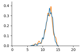
The image is a density plot comparing two distributions, one represented by a blue line and the other by an orange line. The plot shows the probability density of each distribution across a range of values.
### Components/Axes
* **X-axis:** Ranges from 0 to 20, with tick marks at intervals of 5.
* **Y-axis:** Ranges from 0.0 to 0.4, with tick marks at intervals of 0.1.
* **Legend:** There is no explicit legend, but the two distributions are represented by a blue line and an orange line.
### Detailed Analysis
* **Blue Line:** The blue line represents one distribution. It starts near 0 at x=5, rises to a peak around x=12, and then decreases back to near 0 around x=15. The peak density is approximately 0.35.
* **Orange Line:** The orange line represents another distribution. It also starts near 0 at x=5, rises to a peak around x=12, and then decreases back to near 0 around x=15. The peak density is approximately 0.38.
* **Trend Verification:** Both lines show a similar trend: a rise from near 0 to a peak around x=12, followed by a decline back to near 0.
### Key Observations
* Both distributions have a similar shape and are centered around x=12.
* The orange distribution has a slightly higher peak density than the blue distribution.
* The distributions overlap significantly, indicating that they are similar.
### Interpretation
The density plot suggests that the two distributions being compared are very similar. The orange distribution has a slightly higher probability density around the mean, but overall, the shapes and ranges of the distributions are comparable. This could indicate that the two datasets being represented are drawn from similar populations or that they are subject to similar underlying processes.