## Line Graph: Comparison of Two Data Series
### Overview
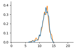
The image depicts a line graph with two overlapping data series (blue and orange lines) plotted against a Cartesian coordinate system. Both lines exhibit a single prominent peak, with the orange line peaking slightly later and higher than the blue line. The graph spans an x-axis range of 0–20 and a y-axis range of 0–0.4.
### Components/Axes
- **X-Axis**: Labeled with numerical increments at 0, 5, 10, 15, and 20. No explicit title is visible.
- **Y-Axis**: Labeled with increments at 0, 0.1, 0.2, 0.3, and 0.4. No explicit title is visible.
- **Legend**: Located in the top-right corner, associating:
- **Blue line**: "Line A"
- **Orange line**: "Line B"
- **Gridlines**: Faint horizontal and vertical gridlines are present for reference.
### Detailed Analysis
1. **Blue Line (Line A)**:
- **Trend**: Starts near 0 at x=0, rises gradually, peaks at approximately **x=12** with a y-value of **~0.35**, then declines sharply to near 0 by x=20.
- **Key Data Points**:
- x=10: ~0.25
- x=12: ~0.35 (peak)
- x=14: ~0.30
- x=16: ~0.15
2. **Orange Line (Line B)**:
- **Trend**: Starts near 0 at x=0, rises more steeply, peaks at approximately **x=14** with a y-value of **~0.38**, then declines gradually to near 0 by x=20.
- **Key Data Points**:
- x=10: ~0.20
- x=14: ~0.38 (peak)
- x=16: ~0.25
- x=18: ~0.10
### Key Observations
- The orange line (Line B) peaks **2 units later** (x=14 vs. x=12) and reaches a **higher maximum** (~0.38 vs. ~0.35) than the blue line (Line A).
- Both lines exhibit similar decay rates after their peaks, converging near y=0 by x=20.
- The lines intersect briefly near x=10–12, suggesting overlapping trends in this region.
### Interpretation
The graph likely compares two related phenomena (e.g., sensor readings, economic indicators, or biological responses) with similar temporal dynamics but distinct peak characteristics. The orange line’s delayed and stronger peak could indicate:
1. A lagged response to an external stimulus affecting Line B.
2. A more pronounced reaction to a variable influencing Line B.
3. Differences in measurement scales or normalization between the two datasets.
The convergence at later x-values suggests shared underlying factors or diminishing returns for both series. The absence of explicit labels or units limits direct interpretation, but the relative trends imply a causal or correlational relationship worth further investigation.