## Scatter Plot: Δf vs. n
### Overview
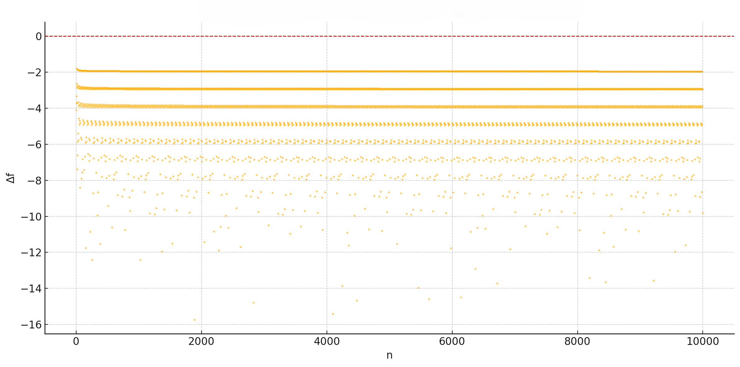
The image presents a scatter plot visualizing the relationship between two variables: Δf (on the y-axis) and n (on the x-axis). The plot displays multiple data series as scattered points, with a horizontal line at Δf = 0. The x-axis ranges from 0 to approximately 10000, and the y-axis ranges from -16 to 0.
### Components/Axes
* **X-axis Label:** "n"
* **Y-axis Label:** "Δf"
* **X-axis Scale:** Linear, from 0 to 10000. Gridlines are present at intervals of 2000.
* **Y-axis Scale:** Linear, from -16 to 0. Gridlines are present at intervals of 2.
* **Data Series 1:** A horizontal line at Δf = 0, colored in red.
* **Data Series 2:** Scattered points clustered around Δf = -4, colored in yellow.
* **Data Series 3:** Scattered points clustered around Δf = -6, colored in yellow.
* **Data Series 4:** Scattered points clustered around Δf = -8, colored in yellow.
* **Data Series 5:** Scattered points clustered around Δf = -10, colored in yellow.
* **Data Series 6:** Scattered points clustered around Δf = -12, colored in yellow.
* **Data Series 7:** Scattered points clustered around Δf = -14, colored in yellow.
* **Data Series 8:** Scattered points clustered around Δf = -16, colored in yellow.
### Detailed Analysis
* **Horizontal Line (Δf = 0):** This line remains constant at Δf = 0 across the entire range of 'n'.
* **Series at Δf ≈ -4:** This series starts with a higher density of points at n = 0, and the density gradually decreases as 'n' increases. The points are relatively tightly clustered around -4, with some scatter.
* **Series at Δf ≈ -6:** Similar to the series at -4, this series also shows a decreasing density of points as 'n' increases. The points are clustered around -6, with some scatter.
* **Series at Δf ≈ -8:** This series exhibits a similar trend to the previous two, with decreasing density and clustering around -8.
* **Series at Δf ≈ -10:** This series exhibits a similar trend to the previous two, with decreasing density and clustering around -10.
* **Series at Δf ≈ -12:** This series exhibits a similar trend to the previous two, with decreasing density and clustering around -12.
* **Series at Δf ≈ -14:** This series exhibits a similar trend to the previous two, with decreasing density and clustering around -14.
* **Series at Δf ≈ -16:** This series exhibits a similar trend to the previous two, with decreasing density and clustering around -16.
The points in each series appear to be randomly distributed around their respective Δf values, with no obvious pattern beyond the decreasing density as 'n' increases.
### Key Observations
* The plot shows multiple horizontal bands of data points, each representing a different Δf value.
* The density of points decreases as 'n' increases for all series except the horizontal line at Δf = 0.
* There is no apparent correlation between 'n' and Δf within each series.
* The horizontal line at Δf = 0 serves as a reference point.
### Interpretation
The data suggests that Δf remains relatively constant for a given value of 'n', but the probability of observing a particular Δf value decreases as 'n' increases. This could indicate a decaying process or a system where the initial conditions have a strong influence on Δf, but this influence diminishes over time (represented by 'n'). The horizontal line at Δf = 0 might represent a baseline or equilibrium state. The multiple horizontal bands suggest that the system can settle into several distinct states, each characterized by a different Δf value. The decreasing density of points as 'n' increases could be interpreted as a convergence towards these stable states. Without further context, it's difficult to determine the specific meaning of 'n' and Δf, but the plot provides valuable insights into the system's behavior. The data could represent a simulation of a physical process, a statistical analysis of experimental data, or a visualization of a mathematical model.