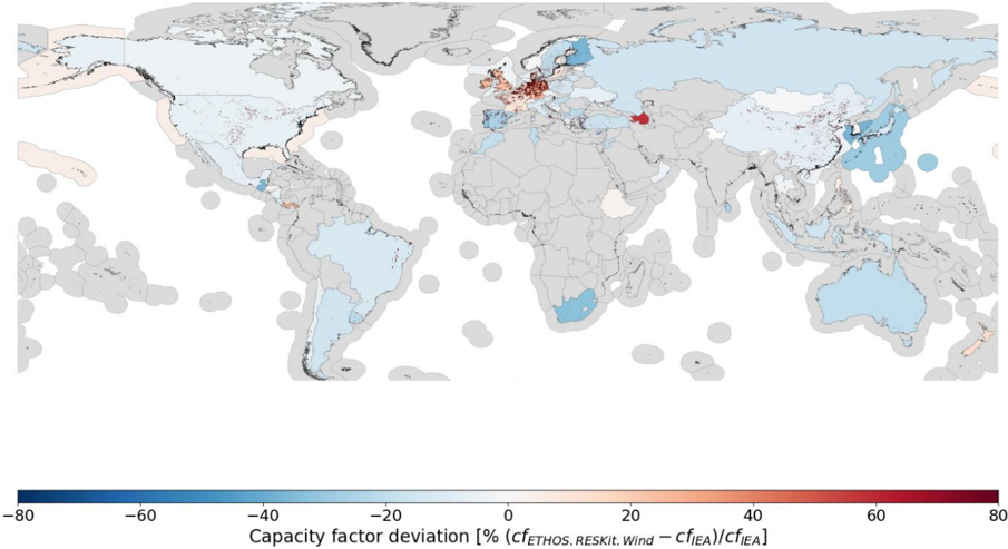
## World Map: Capacity Factor Deviation
### Overview
The image presents a world map displaying the capacity factor deviation, expressed as a percentage, for wind energy. The map uses a color gradient to represent the deviation values, with blue indicating negative deviations and red indicating positive deviations. Grey areas represent regions with no data.
### Components/Axes
* **Map Projection:** A world map projection is used.
* **Color Scale:** A continuous color scale is present at the bottom of the image, ranging from -80% (dark blue) to 80% (dark red). Intermediate colors represent values in between.
* **Axis Label:** "Capacity factor deviation [% (cfETHOS.RESKIL.Wind – cfIEA)/cfIEA]" is the label for the color scale.
* **Geographic Regions:** The map shows continents and oceans, with color-coded regions indicating deviation values.
### Detailed Analysis
The map shows significant regional variations in capacity factor deviation.
* **North America:** Most of North America is colored light blue, indicating a negative deviation, generally between -20% and -40%. Alaska shows a stronger negative deviation, approaching -60%.
* **South America:** South America shows a mix of light blue and grey, with some areas showing a negative deviation between -20% and -40%.
* **Europe:** Europe exhibits a more complex pattern. The UK and Ireland show strong positive deviations, ranging from 40% to 60% (dark red). Scandinavia shows a mix of positive and negative deviations, with some areas around 20% and others around -20%. Southern Europe (Spain, Italy, Greece) shows a mix of light blue and grey.
* **Africa:** Africa is largely grey, indicating a lack of data. Some coastal regions show light blue, indicating negative deviations between -20% and -40%.
* **Asia:** Asia is also largely grey. Some areas of Russia show negative deviations between -20% and -40%. Parts of China and Japan show light blue, indicating negative deviations.
* **Australia:** Australia shows a mix of light blue and grey, with some areas showing negative deviations between -20% and -40%.
* **Oceanic Regions:** Several oceanic regions, particularly in the Southern Hemisphere, show light blue, indicating negative deviations between -20% and -40%.
Specific approximate values (based on color matching to the scale):
* **UK/Ireland:** ~50% to 60%
* **Scandinavia (positive areas):** ~20%
* **Scandinavia (negative areas):** ~-20%
* **Alaska:** ~-60%
* **North America (general):** ~-30%
* **Australia (colored areas):** ~-30%
* **Southern Africa (colored areas):** ~-30%
### Key Observations
* The UK and Ireland stand out as having significantly higher capacity factor deviations than most other regions.
* North America and Australia generally exhibit negative deviations.
* Large portions of the world, particularly Africa and Asia, lack data.
* The deviations appear to be correlated with geographic location, suggesting regional factors influence wind energy capacity factors.
### Interpretation
The map illustrates the variability in wind energy capacity factors across the globe. The positive deviations in the UK and Ireland suggest that the wind resources in these regions are performing better than the IEA baseline (cfIEA) when compared to the ETHOS.RESKIL.Wind model. Conversely, the negative deviations in North America and Australia suggest that wind resources are underperforming relative to the IEA baseline. The lack of data in many regions limits the ability to draw global conclusions.
The formula "cfETHOS.RESKIL.Wind – cfIEA)/cfIEA" indicates that the deviation is calculated as the difference between two capacity factor estimates (ETHOS.RESKIL.Wind and IEA) divided by the IEA estimate. This suggests that the map is comparing the results of two different wind resource assessment models. The map could be used to identify regions where one model significantly over- or under-estimates wind energy potential. The large data gaps suggest that further research is needed to improve the accuracy of wind resource assessments in many parts of the world.