# Technical Document Extraction: Multi-Axis Time Series Analysis
## Overview
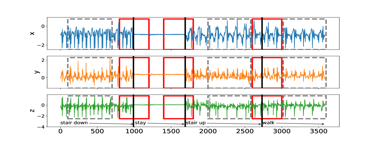
The image presents a multi-axis time series visualization with three distinct subplots (X, Y, Z) representing different data dimensions. Each subplot contains time-based data with annotations and highlighted regions. The visualization uses color-coded lines and geometric markers to denote specific events or states.
---
## Subplot Details
### **X-Axis (Blue Line)**
- **Axis Title**: `x`
- **Range**: 0 to 3500 (horizontal axis)
- **Y-Axis Range**: -2 to 2
- **Data Characteristics**:
- **Line Color**: Blue
- **Trend**:
- Initial high-frequency oscillations (0–500)
- Sharp drop to baseline (500–1000)
- Sustained plateau (1000–1500)
- Increased amplitude oscillations (1500–3500)
- **Annotations**:
- **Red Rectangles**: Highlighted regions at:
- 1000–1500 (centered at 1250)
- 1500–2000 (centered at 1750)
- 2500–3000 (centered at 2750)
- **Vertical Dashed Lines**:
- 500, 1000, 1500, 2000, 2500, 3000, 3500
### **Y-Axis (Orange Line)**
- **Axis Title**: `y`
- **Range**: 0 to 2 (horizontal axis)
- **Y-Axis Range**: -2 to 2
- **Data Characteristics**:
- **Line Color**: Orange
- **Trend**:
- High-frequency oscillations (0–500)
- Sustained plateau (500–1000)
- Increased amplitude oscillations (1000–1500)
- Reduced amplitude oscillations (1500–3500)
- **Annotations**:
- **Red Rectangles**: Highlighted regions at:
- 1000–1500 (centered at 1250)
- 1500–2000 (centered at 1750)
- 2500–3000 (centered at 2750)
- **Vertical Dashed Lines**: Same as X-axis.
### **Z-Axis (Green Line)**
- **Axis Title**: `z`
- **Range**: 0 to 2 (horizontal axis)
- **Y-Axis Range**: -4 to 2
- **Data Characteristics**:
- **Line Color**: Green
- **Trend**:
- High-frequency oscillations (0–500)
- Sustained plateau (500–1000)
- Increased amplitude oscillations (1000–1500)
- Reduced amplitude oscillations (1500–3500)
- **Annotations**:
- **Text Labels**:
- **"stair down"**: Points to the 500–1000 plateau (green line drops to -4).
- **"stay"**: Points to the 1000–1500 plateau (green line remains flat).
- **"stair up"**: Points to the 1500–2000 plateau (green line rises to 2).
- **"walk"**: Points to the 2500–3000 plateau (green line remains flat).
- **Red Rectangles**: Highlighted regions at:
- 1000–1500 (centered at 1250)
- 1500–2000 (centered at 1750)
- 2500–3000 (centered at 2750)
- **Vertical Dashed Lines**: Same as X-axis.
---
## Key Observations
1. **Synchronized Events**:
- Red rectangles and vertical dashed lines align across all subplots, indicating synchronized events or state transitions.
- Example: The 1000–1500 region in all subplots shows a plateau in Y and Z, while X exhibits a sharp drop.
2. **State Transitions**:
- **"stair down"**: Z-axis drops to -4 (500–1000).
- **"stay"**: Z-axis remains flat (1000–1500).
- **"stair up"**: Z-axis rises to 2 (1500–2000).
- **"walk"**: Z-axis remains flat (2500–3000).
3. **Data Consistency**:
- All subplots share the same X-axis time scale (0–3500).
- Color coding (blue for X, orange for Y, green for Z) is consistent across subplots.
---
## Legend and Spatial Grounding
- **Legend**: Not explicitly present. Color coding is inferred from subplot labels:
- **Blue**: X-axis data
- **Orange**: Y-axis data
- **Green**: Z-axis data
- **Spatial Grounding**:
- All annotations and markers are spatially aligned with the X-axis time scale.
---
## Conclusion
The visualization captures time-dependent behavior across three dimensions (X, Y, Z), with clear state transitions marked by annotations and geometric highlights. The red rectangles and dashed lines suggest critical events or thresholds, while the color-coded lines enable cross-subplot analysis.