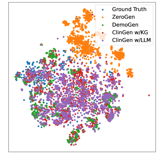
# Technical Document: Scatter Plot Analysis
## Key Components and Labels
- **Legend**: Located in the top-right corner, categorizes data points by color:
- **Blue**: Ground Truth
- **Orange**: ZeroGen
- **Green**: DemoGen
- **Red**: ClinGen w/KG
- **Purple**: ClinGen w/LLM
- **Axes**:
- No explicit axis titles or labels are visible in the image.
- X-axis and Y-axis are present but unlabeled.
## Data Distribution and Trends
1. **Ground Truth (Blue)**:
- Scattered across the plot with moderate density.
- No distinct clustering observed.
2. **ZeroGen (Orange)**:
- Forms a dense cluster in the upper-right quadrant.
- High concentration of points suggests strong grouping.
3. **DemoGen (Green)**:
- Distributed more sparsely than ZeroGen but denser than Ground Truth.
- Points are spread across the central and lower regions.
4. **ClinGen w/KG (Red)**:
- Interspersed among other categories, with moderate density.
- No clear separation from other groups.
5. **ClinGen w/LLM (Purple)**:
- Overlaps significantly with Ground Truth (blue) and DemoGen (green).
- Slightly denser clustering in the lower-left quadrant.
## Observations
- **ZeroGen** exhibits the most cohesive clustering, indicating potential dominance in the measured metric.
- **ClinGen w/LLM** shows partial alignment with Ground Truth, suggesting possible model performance similarities.
- No explicit numerical data or axis scales are provided, limiting quantitative analysis.
## Notes
- The plot lacks axis labels, making it challenging to interpret the exact nature of the measured variables.
- All legend entries are visually confirmed to match their respective data point colors.