## Line Chart with Confidence Interval: Mutual Information Surprise
### Overview
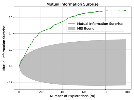
The image is a line chart titled "Mutual Information Surprise" that plots a metric against the number of explorations. It features a primary data series (a green line) and a shaded gray region representing a bound or confidence interval. The chart illustrates how the "Mutual Information Surprise" value and its associated uncertainty evolve as the number of explorations increases.
### Components/Axes
* **Chart Title:** "Mutual Information Surprise" (centered at the top).
* **X-Axis:**
* **Label:** "Number of Explorations (m)"
* **Scale:** Linear scale from 0 to 100.
* **Major Tick Marks:** 0, 20, 40, 60, 80, 100.
* **Y-Axis:**
* **Label:** "Mutual Information Surprise"
* **Scale:** Linear scale from -0.2 to 0.6 (with grid lines extending to ~0.7).
* **Major Tick Marks:** -0.2, 0.0, 0.2, 0.4, 0.6.
* **Legend:** Located in the top-right quadrant of the chart area.
* **Item 1:** A solid green line labeled "Mutual Information Surprise".
* **Item 2:** A gray shaded rectangle labeled "MIS Bound".
* **Grid:** A light gray grid is present for both major x and y ticks.
### Detailed Analysis
**1. Primary Data Series (Green Line - "Mutual Information Surprise"):**
* **Trend Verification:** The line shows a clear, monotonically increasing trend. It rises steeply initially and then gradually plateaus, exhibiting a logarithmic or diminishing returns shape.
* **Data Point Extraction (Approximate):**
* At m = 0: y ≈ 0.0
* At m = 10: y ≈ 0.25
* At m = 20: y ≈ 0.42
* At m = 40: y ≈ 0.55
* At m = 60: y ≈ 0.63
* At m = 80: y ≈ 0.67
* At m = 100: y ≈ 0.68
**2. Shaded Region (Gray Area - "MIS Bound"):**
* **Trend Verification:** The bound starts very narrow (near zero width) at m=0 and expands as the number of explorations increases. The expansion is asymmetric, growing more in the positive direction than the negative.
* **Spatial Grounding & Data Points (Approximate Bounds):**
* At m = 0: Upper bound ≈ 0.0, Lower bound ≈ 0.0 (negligible width).
* At m = 20: Upper bound ≈ 0.22, Lower bound ≈ -0.10.
* At m = 50: Upper bound ≈ 0.28, Lower bound ≈ -0.18.
* At m = 100: Upper bound ≈ 0.33, Lower bound ≈ -0.23.
* The green data line remains consistently above the upper edge of the gray "MIS Bound" region for all m > 0.
### Key Observations
1. **Diminishing Returns:** The most significant increase in "Mutual Information Surprise" occurs within the first 20-30 explorations. After m=60, the curve flattens considerably, suggesting that additional explorations yield progressively smaller increases in the metric.
2. **Growing Uncertainty:** The "MIS Bound" widens substantially with more explorations, indicating that the range of possible or expected values for the metric increases. The uncertainty is not symmetric around the central estimate (the green line).
3. **Consistent Outperformance:** The actual measured "Mutual Information Surprise" (green line) is always higher than the upper limit of the "MIS Bound" (gray area). This suggests the observed performance consistently exceeds the theoretical or baseline bound depicted.
### Interpretation
This chart likely visualizes the performance of an exploration algorithm in a reinforcement learning or information-theoretic context. "Mutual Information Surprise" is a metric that quantifies the information gain or novelty encountered during exploration.
* **What the data suggests:** The algorithm is effective at gathering new information early on, but its rate of discovery slows as it explores more (a common phenomenon). The widening "MIS Bound" could represent a theoretical confidence interval or the performance of a baseline/random exploration strategy. The fact that the green line stays above this bound indicates the algorithm is performing significantly better than this baseline.
* **How elements relate:** The x-axis (explorations) is the independent variable driving the change in the metric (y-axis). The bound provides context, showing that the algorithm's performance is not just high in absolute terms but also superior relative to a reference distribution or limit.
* **Notable implications:** The plateau suggests a potential saturation point where further exploration may not be cost-effective. The asymmetric bound implies the model's uncertainty is skewed, with a greater potential for the true value to be lower than the estimate than higher. This chart would be critical for evaluating exploration efficiency and understanding the trade-off between exploration effort and information gain.