## Scatter Plot: Consistency vs. Accuracy
### Overview
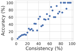
The image is a scatter plot chart displaying the relationship between two percentage-based metrics: "Consistency" on the horizontal axis and "Accuracy" on the vertical axis. The chart shows a strong, positive, roughly linear correlation between the two variables. All data points are represented by blue circles.
### Components/Axes
* **Chart Type:** Scatter Plot
* **X-Axis (Horizontal):**
* **Label:** "Consistency (%)"
* **Scale:** Linear, ranging from 0 to 100.
* **Major Tick Marks:** 0, 20, 40, 60, 80, 100.
* **Y-Axis (Vertical):**
* **Label:** "Accuracy (%)"
* **Scale:** Linear, ranging from 0 to 100.
* **Major Tick Marks:** 0, 20, 40, 60, 80, 100.
* **Data Series:** A single series of data points, all rendered as solid blue circles. There is no legend, as only one data category is present.
* **Spatial Layout:** The plot area is a square grid. Axis labels are positioned conventionally: the Y-axis label is rotated 90 degrees and placed to the left of the axis, and the X-axis label is centered below the axis.
### Detailed Analysis
The data points form a clear upward-sloping trend from the bottom-left to the top-right of the chart. The relationship appears strong and approximately linear, though with some variance.
**Trend Verification:** The overall visual trend is a positive slope, indicating that as Consistency increases, Accuracy also tends to increase.
**Approximate Data Points (Selected for Trend Illustration):**
* At low consistency (~5-15%), accuracy is also low (~5-15%).
* At moderate consistency (~40-50%), accuracy shows a wider spread, ranging from approximately 25% to 55%.
* At high consistency (~80-95%), accuracy is consistently high, clustering between ~85% and 100%.
* The highest concentration of points with near-maximum accuracy (95-100%) occurs at consistency values above 80%.
**Distribution:** The points are not perfectly aligned on a line. There is a visible "cloud" of points around the central trend, indicating that while the correlation is strong, consistency is not the sole determinant of accuracy. For example, at a consistency of approximately 45%, accuracy values range from about 25% to 55%.
### Key Observations
1. **Strong Positive Correlation:** The primary observation is the clear, direct relationship between the two metrics.
2. **Increased Variance at Mid-Range:** The spread of accuracy values for a given consistency value appears greatest in the middle of the range (consistency ~30-60%). At the extremes (very low or very high consistency), the accuracy values are more tightly clustered.
3. **Performance Ceiling:** There is a cluster of data points at the very top-right corner, indicating instances where both consistency and accuracy are at or near 100%.
4. **Absence of Outliers:** There are no extreme outliers that deviate significantly from the main positive trend (e.g., a point with high consistency but very low accuracy).
### Interpretation
This chart demonstrates a fundamental principle in many evaluation contexts: **reliability (consistency) is strongly associated with correctness (accuracy).**
* **What the data suggests:** The tight coupling implies that the process, model, or system being measured produces results that are not only correct but also repeatable. High accuracy without high consistency would be unusual and might indicate lucky guesses or instability. The data here shows that the two qualities develop in tandem.
* **How elements relate:** The X-axis (Consistency) can be viewed as an independent variable or a prerequisite. The trend suggests that improving the consistency of a system is likely a key pathway to improving its overall accuracy. The variance in the middle suggests that other factors also influence accuracy, especially when consistency is moderate.
* **Notable pattern - The "Launch Point":** The data suggests a potential threshold effect. Once consistency surpasses approximately 70-80%, accuracy reliably enters the high-performance zone (above 80%). This could indicate a critical level of stability needed for top-tier performance.
* **Investigative reading:** From a Peircean perspective, this chart represents a **Secondness**—a brute fact of correlation. The next investigative step would be to determine the **Thirdness**: the underlying law or habit that explains *why* consistency and accuracy are linked in this specific system. Is it because consistent models have learned robust features? Or because the measurement of consistency itself is confounded with accuracy? The chart provides the factual ground for such a hypothesis.