## Scatter Plot: Accuracy vs. Consistency
### Overview
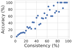
The image is a scatter plot visualizing the relationship between **Accuracy (%)** (y-axis) and **Consistency (%)** (x-axis). Data points are represented as blue dots, with a legend indicating the color. The axes range from 0% to 100% in increments of 20%. The plot shows a general positive trend, with data points clustering along a diagonal from the bottom-left to the top-right.
---
### Components/Axes
- **X-axis (Consistency %)**: Labeled "Consistency (%)", with ticks at 0, 20, 40, 60, 80, and 100.
- **Y-axis (Accuracy %)**: Labeled "Accuracy (%)", with ticks at 0, 20, 40, 60, 80, and 100.
- **Legend**: Located in the **top-right corner**, showing a blue dot with no explicit label.
- **Gridlines**: Horizontal and vertical gridlines at 20% intervals for reference.
---
### Detailed Analysis
- **Data Points**:
- **Lower-left quadrant (0–20% consistency, 0–20% accuracy)**: 5–7 points clustered near the origin.
- **Middle range (20–60% consistency, 20–60% accuracy)**: 10–12 points scattered, with some overlap.
- **Upper-right quadrant (60–100% consistency, 60–100% accuracy)**: 8–10 points, including a dense cluster near 80–100% consistency and 80–100% accuracy.
- **Outliers**:
- A point at ~20% consistency and ~40% accuracy (higher accuracy than expected for low consistency).
- A point at ~80% consistency and ~60% accuracy (lower accuracy than expected for high consistency).
- **Trend**:
The data points exhibit a **positive correlation** (Roughly linear trendline with slight curvature). Accuracy increases as consistency rises, but the relationship is not perfectly linear.
---
### Key Observations
1. **Positive Correlation**: Higher consistency generally aligns with higher accuracy.
2. **Clustering**: Most data points cluster around the diagonal, suggesting a strong relationship.
3. **Outliers**: Two notable deviations from the trend, indicating potential edge cases or measurement noise.
4. **Saturation**: At 80–100% consistency, accuracy plateaus near 80–100%, suggesting diminishing returns.
---
### Interpretation
The plot demonstrates that **consistency and accuracy are positively correlated**, but the relationship is not absolute. The outliers suggest that other factors (e.g., data quality, model robustness) may influence accuracy independently of consistency. The plateau at high consistency implies that beyond a certain threshold, improvements in consistency yield minimal gains in accuracy. This could inform optimization strategies, such as prioritizing consistency improvements only up to a point where accuracy gains are significant.
The absence of a perfect linear relationship highlights the complexity of the underlying system, warranting further investigation into confounding variables.