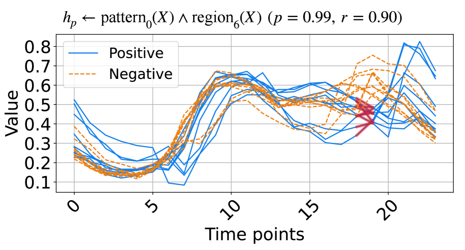
## Line Chart: Hypothesis Testing Results (h_p ← pattern₀(X) ∧ region₆(X))
### Overview
The chart visualizes the evolution of two statistical measures ("Positive" and "Negative") over 20 time points. The title indicates a hypothesis test with high statistical significance (p = 0.99) and strong correlation (r = 0.90). A red arrow highlights a critical region near time point 18.
### Components/Axes
- **X-axis**: "Time points" (0–20, linear scale).
- **Y-axis**: "Value" (0.1–0.8, linear scale).
- **Legend**: Top-left corner, labels:
- **Positive**: Solid blue lines.
- **Negative**: Dashed orange lines.
- **Title**: Top of the chart, includes formula `h_p ← pattern₀(X) ∧ region₆(X)` with parameters `p = 0.99, r = 0.90`.
- **Red Arrow**: Points to a cluster of lines near time point 18.
### Detailed Analysis
- **Positive (Blue Solid Lines)**:
- Starts near 0.3 at time 0.
- Dips below 0.2 between time 5–10.
- Rises sharply to 0.7–0.8 between time 15–20.
- Shows high variability (e.g., peaks at ~0.8 at time 20).
- **Negative (Orange Dashed Lines)**:
- Starts near 0.2 at time 0.
- Rises to ~0.6 between time 5–10.
- Drops below 0.3 after time 15.
- Exhibits erratic fluctuations (e.g., sharp drop at time 18).
- **Red Arrow**:
- Points to a dense cluster of lines (~0.4–0.6 value range) at time 18.
- Overlaps with both Positive and Negative lines, suggesting a critical interaction.
### Key Observations
1. **Divergence at Time 18**: The red arrow highlights a region where Positive and Negative lines intersect or cluster, indicating a potential anomaly or pivotal event.
2. **Trend Reversal**: Positive values surge after time 15, while Negative values decline sharply post-time 15.
3. **Statistical Significance**: High p (0.99) and r (0.90) values suggest the observed patterns are robust and strongly correlated.
### Interpretation
The chart demonstrates a dynamic relationship between "Positive" and "Negative" measures over time. The high p-value confirms the hypothesis test’s reliability, while the r-value indicates a strong linear association between the variables. The red arrow’s focus on time 18 suggests this point marks a critical transition, possibly where the Positive trend overtakes the Negative trend. The overlapping lines in this region may reflect a feedback loop or external influence altering the system’s behavior. The divergence post-time 18 could imply a tipping point or threshold effect in the modeled system.