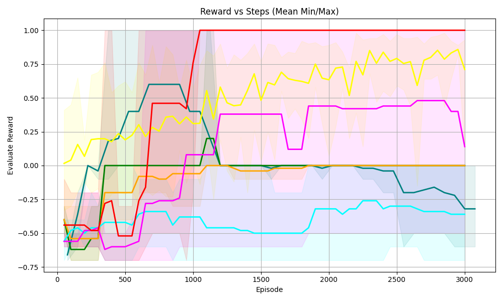
## Line Chart: Reward vs Steps (Mean Min/Max)
### Overview
The image is a line chart displaying the "Evaluate Reward" on the y-axis against "Episode" (steps) on the x-axis. There are multiple lines, each representing a different data series, with shaded regions around each line indicating the min/max range. The chart aims to show how the reward changes over the course of episodes for different experimental conditions.
### Components/Axes
* **Title:** Reward vs Steps (Mean Min/Max)
* **X-axis:**
* Label: Episode
* Scale: 0 to 3000, with markers at 0, 500, 1000, 1500, 2000, 2500, and 3000.
* **Y-axis:**
* Label: Evaluate Reward
* Scale: -0.75 to 1.00, with markers at -0.75, -0.50, -0.25, 0.00, 0.25, 0.50, 0.75, and 1.00.
* **Data Series:** There are 6 distinct data series represented by different colored lines. There is no explicit legend.
### Detailed Analysis
Since there is no legend, I will refer to the lines by their color.
* **Red Line:** Starts at approximately -0.5. Initially decreases slightly, then sharply increases to 1.0 around episode 1000, and remains constant at 1.0 for the rest of the episodes.
* **Yellow Line:** Starts at approximately 0.1. Increases to approximately 0.4 at episode 500, then fluctuates between 0.25 and 0.75 for the remaining episodes.
* **Teal Line:** Starts at approximately -0.6. Increases to approximately 0.6 at episode 750, then decreases to approximately -0.3 at episode 2000, and remains relatively constant at -0.3 for the rest of the episodes.
* **Green Line:** Starts at approximately -0.6. Increases to approximately 0.0 at episode 750, and remains relatively constant at 0.0 for the rest of the episodes.
* **Orange Line:** Starts at approximately -0.5. Increases to approximately 0.0 at episode 1000, and remains relatively constant at 0.0 for the rest of the episodes.
* **Magenta Line:** Starts at approximately -0.6. Increases to approximately 0.5 at episode 750, then fluctuates between -0.3 and 0.5 for the remaining episodes.
### Key Observations
* The red line shows the most significant and rapid improvement in reward, reaching the maximum value of 1.0 and maintaining it.
* The yellow line shows a moderate and fluctuating reward.
* The teal line shows an initial improvement followed by a decline and stabilization at a negative reward.
* The green and orange lines show a gradual improvement to a reward of 0.0 and then remain constant.
* The magenta line shows an initial improvement followed by fluctuations.
### Interpretation
The chart compares the performance of different experimental conditions or algorithms over a series of episodes. The red line indicates the most successful condition, as it quickly achieves and maintains the highest possible reward. The other lines show varying degrees of success, with some conditions leading to negative rewards or fluctuating performance. The shaded regions around each line indicate the variability in the reward for each condition, providing insight into the consistency of the performance. The data suggests that the experimental condition represented by the red line is the most effective, while the others may require further optimization or are inherently less effective.