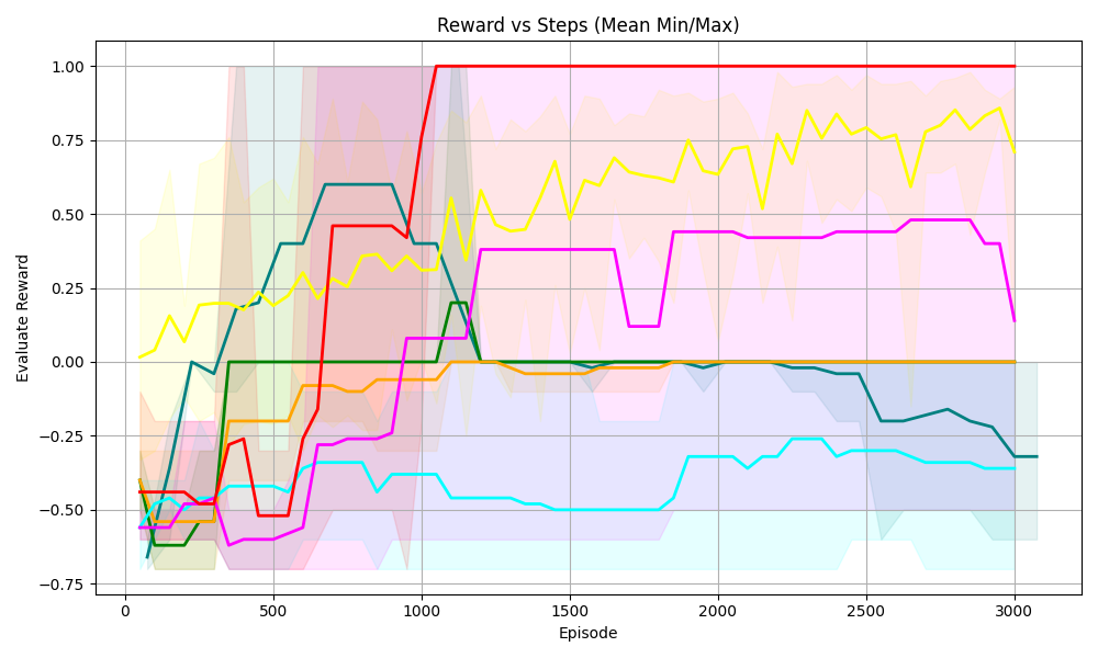
## Line Chart: Reward vs Steps (Mean Min/Max)
### Overview
The chart visualizes the performance of five distinct algorithms or strategies over 3,000 episodes, measured by their evaluation reward. Each line represents a unique data series with shaded regions indicating variability (e.g., confidence intervals or min/max bounds). The x-axis tracks episodes, while the y-axis quantifies reward values from -0.75 to 1.00.
### Components/Axes
- **X-Axis (Episode)**: Discrete intervals from 0 to 3,000, labeled in increments of 500.
- **Y-Axis (Evaluation Reward)**: Continuous scale from -0.75 to 1.00, with gridlines at -0.75, -0.50, 0.00, 0.25, 0.50, 0.75, and 1.00.
- **Legend**: Located in the top-right corner, associating five colors with labels (labels not explicitly visible in the image but implied by color coding).
- **Lines**: Five colored lines (red, yellow, magenta, cyan, green) with shaded regions around them.
### Detailed Analysis
1. **Red Line**:
- **Trend**: Sharp upward spike from ~0.25 at episode 0 to ~1.00 by episode 1,000, followed by a plateau.
- **Values**: Peaks at 1.00 (episode 1,000) and remains stable thereafter.
- **Shading**: Narrowest shaded region, indicating low variability.
2. **Yellow Line**:
- **Trend**: Gradual ascent from ~0.00 at episode 0 to ~0.75 by episode 3,000, with oscillations.
- **Values**: Reaches ~0.75 at episode 3,000; intermediate peaks at ~0.60 (episode 1,500) and ~0.80 (episode 2,500).
- **Shading**: Moderate width, suggesting moderate variability.
3. **Magenta Line**:
- **Trend**: Steady rise from ~-0.50 at episode 0 to ~0.50 by episode 1,000, then stabilizes.
- **Values**: Peaks at ~0.50 (episode 1,000); dips to ~0.40 (episode 2,000) before stabilizing.
- **Shading**: Narrower than yellow but wider than red.
4. **Cyan Line**:
- **Trend**: Initial rise from ~-0.75 at episode 0 to ~-0.25 by episode 1,000, followed by a decline to ~-0.50 by episode 3,000.
- **Values**: Peaks at ~-0.25 (episode 1,000); trough at ~-0.50 (episode 3,000).
- **Shading**: Widest shaded region, indicating high variability.
5. **Green Line**:
- **Trend**: Sharp rise from ~-0.75 at episode 0 to ~0.50 by episode 1,000, then a steep drop to ~-0.25 by episode 3,000.
- **Values**: Peaks at ~0.50 (episode 1,000); trough at ~-0.25 (episode 3,000).
- **Shading**: Moderate width, with a pronounced dip post-peak.
### Key Observations
- **Red Line Dominance**: Achieves the highest reward (1.00) and maintains stability, suggesting optimal performance.
- **Yellow Line Resilience**: Gradual improvement with oscillations, indicating robustness over time.
- **Cyan Line Volatility**: High variability and eventual decline suggest instability or inefficiency.
- **Green Line Anomaly**: Rapid initial success followed by a sharp decline, possibly indicating overfitting or resource exhaustion.
- **Shaded Regions**: Red and magenta lines have the narrowest shading, implying higher confidence in their performance metrics.
### Interpretation
The chart demonstrates divergent algorithmic behaviors:
- **Red Line**: Likely represents a stable, high-performing strategy that maximizes reward consistently.
- **Yellow Line**: Reflects a strategy that improves incrementally, balancing exploration and exploitation.
- **Cyan/Green Lines**: Highlight unstable or short-lived strategies, with cyan’s volatility and green’s abrupt decline suggesting potential flaws in their design.
- **Shaded Regions**: Quantify uncertainty, with red and magenta lines showing the most reliable outcomes.
This analysis underscores the importance of algorithmic stability and adaptability in dynamic environments, with red and yellow lines serving as benchmarks for effective performance.