## Chart Type: Pie Chart
### Overview
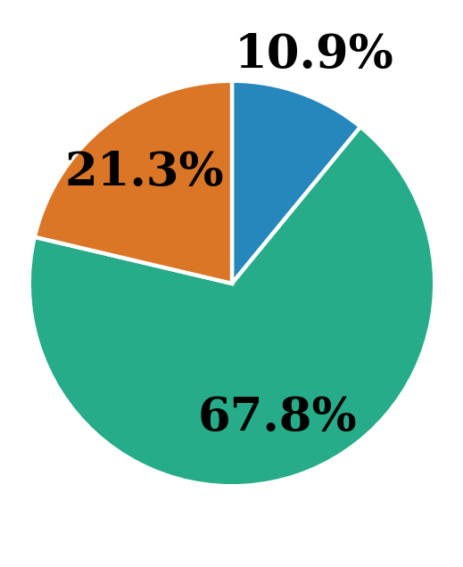
The image is a pie chart displaying three categories with their respective percentages. The categories are represented by different colors: blue, orange, and green. The percentages are displayed directly on the chart.
### Components/Axes
* **Categories:** The pie chart is divided into three sections, each representing a different category.
* **Percentages:** Each section is labeled with a percentage value, indicating its proportion of the whole.
* **Colors:** The sections are colored blue, orange, and green.
### Detailed Analysis
* **Blue Section:** Located in the top-right quadrant, representing 10.9% of the total.
* **Orange Section:** Located in the top-left quadrant, representing 21.3% of the total.
* **Green Section:** Occupies the majority of the pie chart, located in the bottom half, representing 67.8% of the total.
### Key Observations
* The green category makes up the largest portion of the pie chart, accounting for over two-thirds of the total.
* The blue category is the smallest, representing approximately 10.9%.
* The orange category represents approximately 21.3%.
### Interpretation
The pie chart visually represents the distribution of a whole into three distinct parts. The green category is the dominant component, while the blue category is the smallest. The chart provides a clear and concise comparison of the relative sizes of the three categories. The data suggests that the element represented by the green section is significantly more prevalent than the other two.