\n
## Pie Chart: Percentage Distribution
### Overview
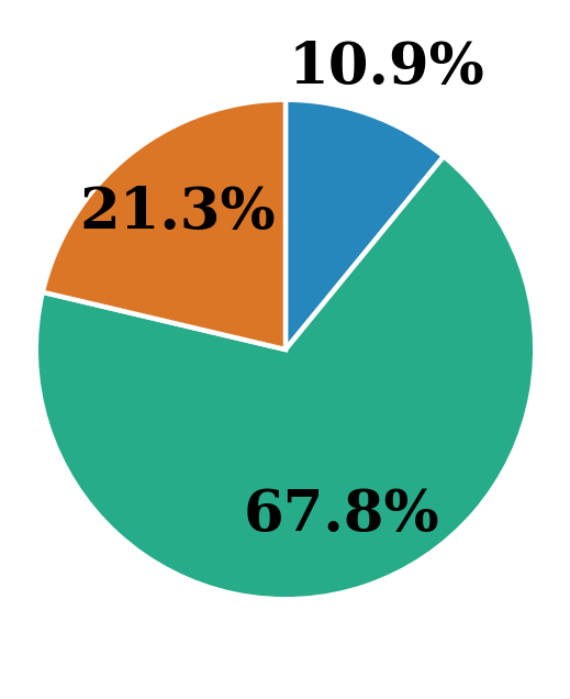
The image is a pie chart illustrating the distribution of percentages across three categories. The chart is visually divided into three segments, each representing a different proportion of the whole. The percentages are directly labeled on each segment.
### Components/Axes
The chart lacks traditional axes. It consists of three segments, each representing a category with an associated percentage. There is no explicit legend, as the percentages are directly embedded within each segment.
### Detailed Analysis
The pie chart displays the following data:
* **Segment 1 (Green):** 67.8% - This segment occupies the largest portion of the pie chart, positioned at the bottom.
* **Segment 2 (Orange):** 21.3% - This segment is positioned to the left of the green segment.
* **Segment 3 (Blue):** 10.9% - This segment is positioned at the top of the pie chart.
The sum of the percentages is approximately 100% (67.8 + 21.3 + 10.9 = 100.0%).
### Key Observations
The distribution is heavily skewed towards the green segment, which represents the majority (67.8%) of the total. The orange segment represents a significant minority (21.3%), while the blue segment represents a small portion (10.9%).
### Interpretation
The data suggests a strong dominance of one category (represented by the green segment) over the other two. This could represent a situation where a particular option, characteristic, or group is significantly more prevalent than others. The relatively small size of the blue segment indicates that the corresponding category is less common or less important in the context of the data. Without further context, it is difficult to determine the specific meaning of these percentages, but the chart clearly demonstrates a significant imbalance in the distribution. The chart is a simple visual representation of proportions, and its effectiveness relies on the viewer understanding what each segment represents.