## Pie Chart: Proportional Distribution of Three Categories
### Overview
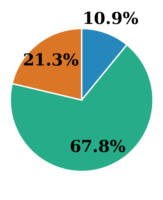
The image displays a simple pie chart divided into three segments, each representing a percentage of a whole. The chart contains no title, legend, or axis labels, presenting only the colored segments and their corresponding percentage values.
### Components/Axes
- **Chart Type**: Pie Chart (circular statistical graphic)
- **Segments**: Three distinct colored segments.
- **Labels**: Each segment has a percentage value directly overlaid on it.
- **Legend**: None present.
- **Title/Axis Labels**: None present.
### Detailed Analysis
The chart is composed of three segments with the following characteristics, listed from largest to smallest:
1. **Teal/Green Segment**
* **Color**: A medium teal or sea-green.
* **Percentage**: **67.8%**
* **Spatial Placement**: This is the dominant segment, occupying the entire bottom half and extending up the right side of the circle. It starts from approximately the 3 o'clock position and sweeps clockwise to roughly the 10 o'clock position.
* **Visual Trend**: This segment represents a clear majority, comprising over two-thirds of the total.
2. **Orange Segment**
* **Color**: A burnt orange or rust color.
* **Percentage**: **21.3%**
* **Spatial Placement**: Located in the upper-left quadrant of the pie. It is adjacent to the teal segment on its left side and the blue segment on its right.
* **Visual Trend**: Represents a significant minority, roughly one-fifth of the total.
3. **Blue Segment**
* **Color**: A medium blue.
* **Percentage**: **10.9%**
* **Spatial Placement**: Located in the upper-right quadrant, forming a wedge between the orange and teal segments.
* **Visual Trend**: Represents the smallest portion, approximately one-tenth of the total.
**Data Integrity Check**: The sum of the percentages (67.8% + 21.3% + 10.9%) equals **100.0%**, confirming the chart represents a complete whole.
### Key Observations
* **Dominant Majority**: The teal segment (67.8%) is overwhelmingly the largest category, more than three times the size of the next largest segment.
* **Clear Hierarchy**: There is a distinct and significant drop-off between each category: from majority (67.8%) to a substantial minority (21.3%) to a small minority (10.9%).
* **Missing Context**: The most critical observation is the complete absence of categorical labels. The chart shows *how much* but provides zero information on *what* is being measured. There is no title, legend, or annotation to define what the teal, orange, and blue segments represent.
### Interpretation
This pie chart effectively communicates a proportional relationship where one category holds a commanding majority share. The visual weight of the teal segment immediately draws the eye, emphasizing its dominance.
However, without categorical labels, the chart's informational value is purely abstract. It demonstrates a **distribution pattern** (a large majority, a medium minority, and a small minority) but cannot convey any specific meaning. To be useful, it would require a title (e.g., "Market Share by Company," "Survey Response Distribution," "Budget Allocation by Department") and a legend mapping colors to specific categories (e.g., Teal = "Product A," Orange = "Product B," Blue = "Product C").
The design is minimalist, using direct labeling on the segments for clarity, which is effective for a simple three-category chart. The color choices are distinct and provide good visual separation between the segments.