## [Composite Scientific Figure]: Regime Comparison (Rich vs Lazy) Across Tasks
### Overview
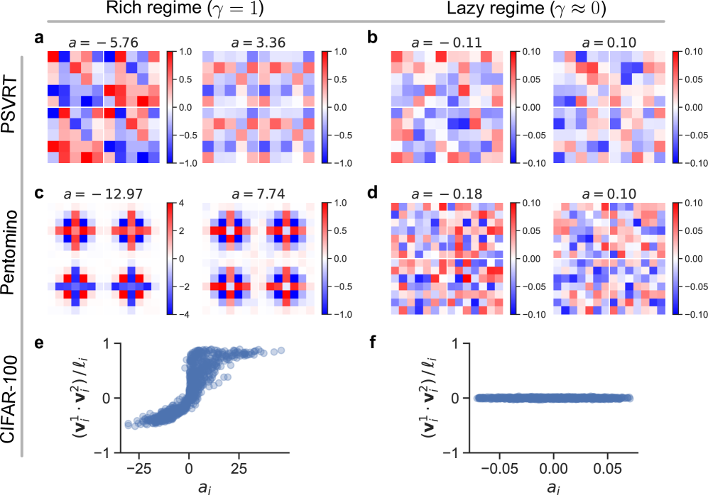
The image is a multi-panel scientific figure comparing two regimes—**Rich regime (γ = 1)** (left column) and **Lazy regime (γ ≈ 0)** (right column)—across three tasks/datasets: *PSVRT*, *Pentomino*, and *CIFAR-100*. It includes heatmaps (subplots a–d) and scatter plots (subplots e–f) to visualize data distributions, patterns, and relationships.
### Components/Axes
- **Regimes**: Two columns labeled *“Rich regime (γ = 1)”* (left) and *“Lazy regime (γ ≈ 0)”* (right).
- **Rows**: Three rows labeled *“PSVRT”*, *“Pentomino”*, and *“CIFAR-100”* (vertical labels on the left).
- **Subplots**:
- **a (PSVRT, Rich)**: Two 10×10 (approx) heatmaps with color bars (range: −1.0 to 1.0). Titles: *“a = −5.76”* (left) and *“a = 3.36”* (right).
- **b (PSVRT, Lazy)**: Two 10×10 (approx) heatmaps with color bars (range: −0.10 to 0.10). Titles: *“a = −0.11”* (left) and *“a = 0.10”* (right).
- **c (Pentomino, Rich)**: Two 5×5 (approx) heatmaps. Left: Color bar (range: −4 to 4), title *“a = −12.97”*; Right: Color bar (range: −1.0 to 1.0), title *“a = 7.74”*.
- **d (Pentomino, Lazy)**: Two 10×10 (approx) heatmaps with color bars (range: −0.10 to 0.10). Titles: *“a = −0.18”* (left) and *“a = 0.10”* (right).
- **e (CIFAR-100, Rich)**: Scatter plot with x-axis *“a_i”* (range: ~−25 to 25) and y-axis *“(v_i^1 · v_i^2)/ℓ_i”* (range: −1 to 1).
- **f (CIFAR-100, Lazy)**: Scatter plot with x-axis *“a_i”* (range: ~−0.05 to 0.05) and y-axis *“(v_i^1 · v_i^2)/ℓ_i”* (range: −1 to 1).
### Detailed Analysis
#### Heatmaps (a–d)
- **PSVRT (a, b)**:
- **a (Rich)**: Left heatmap (*a = −5.76*) has more blue (negative) and red (positive) regions; right heatmap (*a = 3.36*) has more white (near 0) with sparse red/blue. Color bar: −1.0 (blue) to 1.0 (red).
- **b (Lazy)**: Left heatmap (*a = −0.11*) has blue/red regions; right heatmap (*a = 0.10*) is mostly white with sparse blue/red. Color bar: −0.10 (blue) to 0.10 (red).
- **Pentomino (c, d)**:
- **c (Rich)**: Left heatmap (*a = −12.97*) has strong blue/red (high magnitude, color bar: −4 to 4); right heatmap (*a = 7.74*) has more white with sparse red/blue (color bar: −1.0 to 1.0).
- **d (Lazy)**: Left heatmap (*a = −0.18*) has blue/red regions; right heatmap (*a = 0.10*) is mostly white with sparse blue/red. Color bar: −0.10 (blue) to 0.10 (red).
#### Scatter Plots (e, f)
- **e (CIFAR-100, Rich)**: X-axis *“a_i”* (range: ~−25 to 25), Y-axis *“(v_i^1 · v_i^2)/ℓ_i”* (range: −1 to 1). Data points cluster densely around *a_i ≈ 0* and spread outward, showing a **positive correlation** (as *a_i* increases, y-values increase).
- **f (CIFAR-100, Lazy)**: X-axis *“a_i”* (range: ~−0.05 to 0.05), Y-axis same as e. Data points form a dense cluster around *y ≈ 0* with minimal spread, showing **no strong correlation** (flat trend).
### Key Observations
1. **Regime Magnitude**: Rich regime (γ=1) has larger data magnitudes (wider color bars, larger *a_i* range) than Lazy regime (γ≈0) (narrower color bars, smaller *a_i* range).
2. **Pattern Structure**: Rich regime heatmaps (a, c) show more structured patterns (e.g., distinct blue/red regions in Pentomino), while Lazy regime heatmaps (b, d) are more uniform/white (less structure).
3. **CIFAR-100 Trend**: Rich regime (e) has a clear positive correlation between *a_i* and the dot product term; Lazy regime (f) is flat (no correlation).
### Interpretation
The figure illustrates how a parameter γ (defining “Rich” vs “Lazy” regimes) impacts model behavior or data representation across tasks:
- **Rich regime (γ=1)**: Likely corresponds to a more expressive model or data with larger variance, showing structured patterns (heatmaps) and strong correlations (CIFAR-100 scatter plot).
- **Lazy regime (γ≈0)**: Corresponds to a more constrained model (e.g., regularized) or data with smaller variance, showing less structure (heatmaps) and weak correlations (CIFAR-100 scatter plot).
This comparison suggests γ controls model expressivity or data complexity: Rich regimes enable richer representations (useful for complex tasks), while Lazy regimes enforce simplicity (useful for regularization or low-variance data). The heatmaps and scatter plots collectively demonstrate how regime choice shapes data distributions and relationships, with implications for model generalization and task performance.
(Note: All text is in English; no non-English text is present.)