## Circuit Diagram and Correlation Plot: Signal Correlation Analysis
### Overview
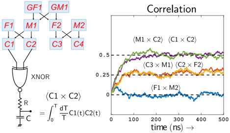
The image is a composite technical figure consisting of two main parts: a **circuit diagram** on the left and a **correlation plot** on the right. The diagram illustrates a system for computing the correlation between two signals, C1(t) and C2(t), using an XNOR gate and an RC integrator. The plot displays the time-evolution of correlation values for several signal pairs over a 500 ns period.
### Components/Axes
#### Left: Circuit Diagram
* **Input Signals:** Labeled as `GF1`, `GM1`, `F1`, `M1`, `C1`, `C2`, `F2`, `M2`, `C3`, `C4`. These are arranged in a hierarchical, tree-like structure.
* **Logic Gate:** An `XNOR` gate receives inputs derived from the signal tree.
* **Integrator Circuit:** The output of the XNOR gate feeds into a series resistor (`R`) and parallel capacitor (`C`) circuit.
* **Mathematical Definition:** Below the circuit, the correlation function is defined as:
`(C1 × C2) = ∫₀ᵀ (dT/T) C1(t)C2(t)`
This represents the time-averaged product of signals C1 and C2 over interval T.
#### Right: Correlation Plot
* **Title:** `Correlation`
* **X-axis:** Label is `time (ns) →`. Scale runs from 0 to 500 ns with major ticks at 0, 100, 200, 300, 400, 500.
* **Y-axis:** No explicit label, but represents correlation value. Scale runs from 0 to 0.5 with major ticks at 0, 0.25, 0.5.
* **Legend:** Located in the top-right quadrant of the plot area. It identifies five data series by color and label:
* Green line: `(M1 × C2)`
* Purple line: `(C1 × C2)`
* Orange line: `(C3 × M1)`
* Yellow line: `(C2 × F2)`
* Blue line: `(F1 × M2)`
### Detailed Analysis
#### Circuit Diagram Analysis
The diagram depicts a signal processing pathway. Signals (F1, M1, C1, C2, etc.) are combined through a network of connections (represented by lines) before being fed into an XNOR gate. The XNOR operation is a logical equivalence test. Its output is then smoothed/integrated by the RC circuit, which physically implements the time-averaging integral shown in the equation. This setup is designed to compute the correlation between the pair of signals `C1` and `C2`.
#### Correlation Plot Data & Trends
The plot shows the computed correlation value over time for five different signal pairs. All series begin at t=0 ns.
1. **`(M1 × C2)` - Green Line:**
* **Trend:** Rises steeply from ~0.2 at t=0, peaks near 0.5 around t=150 ns, then stabilizes with minor fluctuations around 0.5 for the remainder of the time.
* **Approximate Values:** Starts ~0.2, reaches ~0.5 by 150 ns, holds ~0.5 ± 0.02.
2. **`(C1 × C2)` - Purple Line:**
* **Trend:** Follows a very similar trajectory to the green line but is consistently slightly lower. Rises from ~0.15, approaches 0.5, and stabilizes around 0.45-0.48.
* **Approximate Values:** Starts ~0.15, reaches ~0.45 by 200 ns, holds ~0.46 ± 0.02.
3. **`(C3 × M1)` - Orange Line:**
* **Trend:** Rises from near 0, increases steadily to about 0.25 by t=100 ns, and then plateaus, fluctuating around the 0.25 level.
* **Approximate Values:** Starts ~0, reaches ~0.25 by 100 ns, holds ~0.25 ± 0.03.
4. **`(C2 × F2)` - Yellow Line:**
* **Trend:** Nearly identical in behavior and value to the orange line (`C3 × M1`). Rises from near 0 to plateau around 0.25.
* **Approximate Values:** Starts ~0, reaches ~0.25 by 100 ns, holds ~0.25 ± 0.03.
5. **`(F1 × M2)` - Blue Line:**
* **Trend:** Shows no sustained positive correlation. It fluctuates around the zero line throughout the entire period, with values mostly between -0.05 and +0.05.
* **Approximate Values:** Fluctuates around 0 ± 0.05.
### Key Observations
* **Two Distinct Correlation Levels:** The data clearly separates into two groups: high correlation (~0.5) for pairs `(M1 × C2)` and `(C1 × C2)`, and moderate correlation (~0.25) for pairs `(C3 × M1)` and `(C2 × F2)`.
* **Negligible Correlation:** The pair `(F1 × M2)` shows no significant correlation, acting as a control or baseline.
* **Temporal Dynamics:** All non-zero correlations establish their steady-state value within the first 100-200 ns and remain stable thereafter.
* **Circuit-Plot Connection:** The circuit diagram specifically defines the correlation for `(C1 × C2)`, which is one of the two highest-correlation pairs shown in the plot (purple line).
### Interpretation
This figure demonstrates a method for measuring signal correlations, likely in a computational or neural network context. The circuit is a physical or simulated implementation of a correlator. The plot validates its function and reveals the underlying structure of the signal relationships.
* **What the data suggests:** Signals `M1` and `C2` are strongly correlated, as are `C1` and `C2`. This implies these signal pairs carry very similar information or are driven by common sources. The pairs `(C3 × M1)` and `(C2 × F2)` share a weaker, but consistent, relationship. The lack of correlation for `(F1 × M2)` indicates these signals are independent.
* **How elements relate:** The circuit diagram provides the *mechanism* (how correlation is computed), while the plot provides the *result* (the measured correlations). The specific pair `(C1 × C2)` highlighted in the diagram is shown to be one of the most strongly correlated in the system.
* **Notable patterns:** The clear stratification of correlation values into discrete levels (~0.5, ~0.25, ~0) suggests a structured, possibly digital or quantized, relationship between the underlying signal sources. The rapid convergence to steady-state indicates the system or signals reach equilibrium quickly.