## Diagram and Chart: Correlation in a System
### Overview
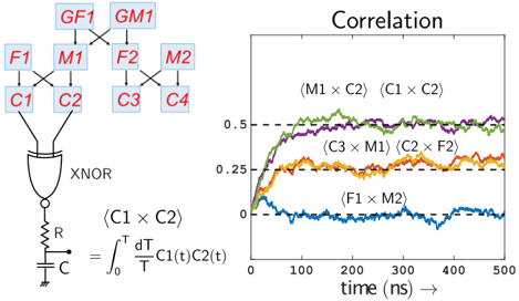
The image presents a combination of a circuit diagram and a correlation chart. The circuit diagram on the left shows a network of interconnected components, culminating in an XNOR gate connected to an RC circuit. The chart on the right displays the correlation between different pairs of signals within the system over time.
### Components/Axes
**Left Side: Circuit Diagram**
* **Nodes:** The diagram features several nodes labeled `GF1`, `GM1`, `F1`, `M1`, `F2`, `M2`, `C1`, `C2`, `C3`, and `C4`. These nodes are interconnected by lines, suggesting signal flow or relationships. The labels are in red.
* **Logic Gate:** An XNOR gate receives inputs from nodes `C1` and `C2`. The output of the XNOR gate is connected to an RC circuit.
* **RC Circuit:** The RC circuit consists of a resistor `R` and a capacitor `C` connected in series to ground.
* **Equation:** Below the XNOR gate, the equation `<C1 x C2> = ∫[0 to T] dT/T C1(t)C2(t)` is displayed.
**Right Side: Correlation Chart**
* **Title:** "Correlation"
* **X-axis:** "time (ns) →" with a scale from 0 to 500 in increments of 100.
* **Y-axis:** The y-axis is not explicitly labeled, but has markers at 0, 0.25, and 0.5.
* **Data Series:** The chart displays four data series, each representing the correlation between different pairs of signals:
* **(M1 x C2) (C1 x C2)**: Green line.
* **(C3 x M1) (C2 x F2)**: Purple line.
* **(F1 x M2)**: Blue line.
* **Horizontal Dashed Lines:** There are two horizontal dashed lines at approximately y = 0.25 and y = 0.5.
### Detailed Analysis
**Circuit Diagram**
* The nodes `GF1` and `GM1` appear to be the starting points of the network.
* `F1` and `M1` are connected to `C1` and `C2`, respectively.
* `F2` and `M2` are connected to `C3` and `C4`, respectively.
* `C1` and `C2` feed into the XNOR gate.
**Correlation Chart**
* **Green Line (M1 x C2) (C1 x C2):** Starts at approximately 0.2, rises sharply to approximately 0.5 within the first 100 ns, and then fluctuates around 0.5.
* **Purple Line (C3 x M1) (C2 x F2):** Starts at approximately 0.1, rises sharply to approximately 0.45 within the first 100 ns, and then fluctuates around 0.45.
* **Orange Line (C3 x M1) (C2 x F2):** Starts at approximately 0.1, rises sharply to approximately 0.25 within the first 100 ns, and then fluctuates around 0.25.
* **Blue Line (F1 x M2):** Starts at approximately 0, fluctuates around 0 throughout the entire time range.
### Key Observations
* The green and purple lines show a strong positive correlation that develops quickly.
* The orange line shows a moderate positive correlation.
* The blue line shows almost no correlation.
* The correlations seem to stabilize after approximately 100 ns.
### Interpretation
The image suggests an analysis of signal correlations within a system represented by the circuit diagram. The chart indicates that certain signal pairs (M1 x C2, C1 x C2, C3 x M1, C2 x F2) exhibit significant positive correlation, implying a strong relationship or dependency between them. The signal pair F1 x M2, however, shows negligible correlation, suggesting independence or a weak relationship. The equation provided likely represents the method used to calculate the correlation between signals C1 and C2 over a time period T. The RC circuit connected to the XNOR gate likely serves as a filter or integrator, influencing the signals being analyzed. The rapid rise in correlation for the green and purple lines suggests a fast response or strong coupling between the corresponding signals.