## [Heatmap Pair]: Comparison of Ideal vs. Empirical Correlation Matrices
### Overview
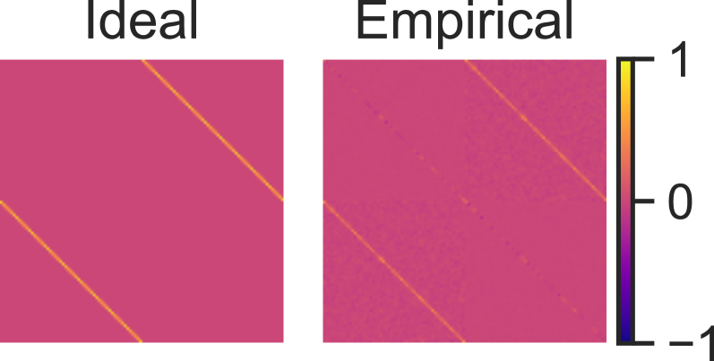
The image displays two square heatmaps positioned side-by-side, labeled "Ideal" and "Empirical," respectively. They are accompanied by a shared vertical color scale bar on the far right. The heatmaps visually represent numerical data, likely correlation matrices, where color intensity corresponds to a value between -1 and 1. The "Ideal" map shows a perfect, noise-free pattern, while the "Empirical" map shows a similar pattern with visible noise or variance.
### Components/Axes
* **Titles:** The text "Ideal" is centered above the left heatmap. The text "Empirical" is centered above the right heatmap.
* **Color Scale Bar:** Located on the far right of the image, oriented vertically.
* **Axis Markers/Labels:** The scale is labeled with three numerical values: `1` at the top, `0` in the middle, and `-1` at the bottom.
* **Color Gradient:** The bar shows a continuous color gradient. The top (value `1`) is bright yellow. The middle (value `0`) is a pink/magenta hue. The bottom (value `-1`) is dark purple/black.
* **Heatmap Content:** Both heatmaps are square matrices. The axes of the matrices themselves are not labeled with text, implying they represent indices (e.g., variable 1, variable 2, etc.).
### Detailed Analysis
**1. "Ideal" Heatmap (Left):**
* **Background:** The entire background is a uniform pink/magenta color, corresponding to the value `0` on the color scale.
* **Data Series/Trends:**
* **Main Diagonal:** A sharp, continuous, bright yellow line runs from the top-left corner to the bottom-right corner. This indicates a value of `1` for all elements where the row index equals the column index.
* **Anti-Diagonal:** A second sharp, continuous, bright yellow line runs from the bottom-left corner to the top-right corner. This indicates a value of `1` for elements where the row index and column index sum to a constant (e.g., in a 4x4 matrix, positions (4,1), (3,2), (2,3), (1,4)).
* **Pattern:** The pattern is perfectly clean and geometric, with no noise or deviation from the two diagonal lines.
**2. "Empirical" Heatmap (Right):**
* **Background:** The background is predominantly pink/magenta (value ~`0`), but it is not perfectly uniform. There is visible granular noise or speckling throughout, with slight variations in the pink hue.
* **Data Series/Trends:**
* **Main Diagonal:** A bright yellow line is clearly visible from the top-left to the bottom-right. It is slightly less sharp than in the "Ideal" case, with some minor pixelation or variation in intensity along its length.
* **Anti-Diagonal:** A bright yellow line is also visible from the bottom-left to the top-right. Similar to the main diagonal, it shows slight imperfections and noise.
* **Noise:** Scattered yellowish pixels (values > `0`) and slightly darker pink pixels (values < `0`) are present across the entire matrix, not confined to the diagonals. This indicates deviations from the ideal `0` value in the off-diagonal elements.
* **Pattern:** The core two-diagonal structure is preserved but is overlaid with a layer of random noise, typical of real-world or simulated empirical data.
### Key Observations
1. **Structural Similarity:** The "Empirical" heatmap successfully replicates the fundamental two-diagonal structure of the "Ideal" case.
2. **Noise Introduction:** The primary difference is the presence of broadband noise in the "Empirical" data, affecting both the background (off-diagonal elements) and the signal lines (diagonal elements).
3. **Value Range:** Both heatmaps appear to utilize only the upper half of the color scale (from `0` to `1`). There are no visually distinct dark purple regions that would indicate strong negative correlations (values near `-1`).
4. **Spatial Layout:** The color bar is positioned to the right of both heatmaps, serving as a common legend. The heatmaps are of equal size and are aligned horizontally.
### Interpretation
This image is a classic visualization comparing a theoretical model to observed data, most likely in the context of **correlation or similarity matrices**.
* **What the Data Suggests:** The "Ideal" matrix represents a perfect, deterministic relationship. The two diagonals suggest a system where each element is perfectly correlated with itself (main diagonal) and with one specific other element (anti-diagonal). This could model a system with paired relationships or a specific symmetric structure.
* **Relationship Between Elements:** The "Empirical" matrix demonstrates that real-world measurements or simulations approximate this ideal structure but are subject to noise. The noise could stem from measurement error, sampling variance, or unmodeled interactions in the system.
* **Notable Anomalies/Trends:** The absence of strong negative values (dark purple) is notable. It suggests the underlying phenomenon being measured does not produce strong anti-correlations, or the scale is normalized in a way that centers on zero. The noise appears relatively uniform, indicating it may be random (e.g., Gaussian) rather than systematic.
* **Why it Matters:** This type of comparison is fundamental in scientific and engineering fields. It allows researchers to validate models against data, quantify the signal-to-noise ratio, and assess whether the core theoretical structure is supported by empirical evidence. The visual immediately communicates that the model captures the essential pattern but that real-world data is inherently "messier."