## Heatmaps: Ideal vs. Empirical
### Overview
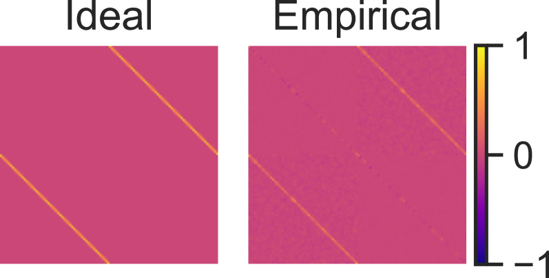
The image presents two heatmaps side-by-side, labeled "Ideal" and "Empirical." Both heatmaps display a correlation-like matrix, with color intensity representing the strength of the relationship. The "Ideal" heatmap shows a simplified, theoretical correlation, while the "Empirical" heatmap displays a more complex, real-world correlation pattern. A colorbar on the right indicates the correlation values, ranging from -1 to 1.
### Components/Axes
* **Titles:** "Ideal" (left heatmap), "Empirical" (right heatmap)
* **Colorbar:** Located on the right side of the "Empirical" heatmap.
* Scale: Ranges from -1 (bottom, dark purple) to 1 (top, yellow).
* Markers: -1, 0, 1
### Detailed Analysis
**Ideal Heatmap:**
* The heatmap is predominantly pink.
* A yellow line runs diagonally from the top-right to the bottom-left.
* Another yellow line runs diagonally from the top-left to the bottom-right.
**Empirical Heatmap:**
* The heatmap is predominantly pink, but with more variation in color intensity compared to the "Ideal" heatmap.
* A yellow line runs diagonally from the top-right to the bottom-left.
* Another yellow line runs diagonally from the top-left to the bottom-right.
* There are speckles and variations in color intensity throughout the heatmap, indicating more complex correlations.
**Colorbar:**
* The colorbar ranges from dark purple at -1 to yellow at 1, with a midpoint of pink at 0.
### Key Observations
* The "Ideal" heatmap represents a simplified correlation structure, while the "Empirical" heatmap shows a more complex, real-world correlation structure.
* Both heatmaps show diagonal lines, indicating strong correlations along the diagonal.
* The "Empirical" heatmap has more noise and variation compared to the "Ideal" heatmap.
### Interpretation
The image compares a theoretical, "Ideal" correlation structure with an "Empirical," real-world correlation structure. The "Ideal" heatmap shows a simplified pattern, likely representing a perfect or near-perfect correlation along the diagonal. The "Empirical" heatmap, on the other hand, shows a more complex pattern with noise and variations, indicating that real-world correlations are rarely as clean or straightforward as theoretical models might suggest. The diagonal lines in both heatmaps suggest that there is still a strong underlying correlation, but the "Empirical" heatmap reveals the presence of other factors or variables that influence the correlation structure.