\n
## Heatmap: Ideal vs. Empirical Data
### Overview
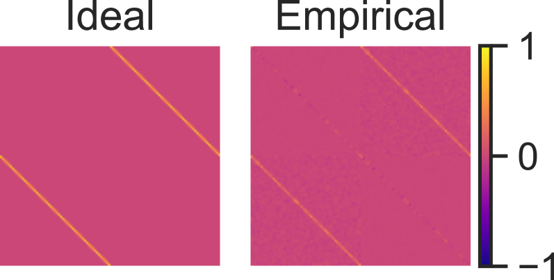
The image presents a comparison between an "Ideal" and an "Empirical" dataset, visualized as heatmaps. Both heatmaps display a similar pattern of diagonal lines, but the "Empirical" heatmap exhibits significant noise and variation compared to the clean, uniform "Ideal" heatmap. A colorbar on the right indicates the value scale, ranging from -1 to 1.
### Components/Axes
The image consists of three main components:
1. **"Ideal" Heatmap:** Located on the left side of the image.
2. **"Empirical" Heatmap:** Located in the center of the image.
3. **Colorbar:** Positioned on the right side of the image, representing the value scale.
There are no explicit axes labels, but the heatmaps represent a two-dimensional space where color intensity corresponds to a numerical value. The colorbar has the following markings:
* Top: 1
* Middle: 0
* Bottom: -1
### Detailed Analysis
Both heatmaps appear to be square, with the same dimensions. The "Ideal" heatmap shows two distinct diagonal lines. The color of these lines is a bright yellow/orange, indicating a value close to 1. The background color is a uniform pink/red, indicating a value around 0.
The "Empirical" heatmap also displays two diagonal lines, but these lines are significantly more fragmented and noisy. The color of the lines varies, ranging from yellow/orange (value close to 1) to red/purple (value close to 0 or negative). There are numerous small areas of blue/purple scattered throughout the heatmap, indicating negative values.
The colorbar shows a gradient from blue (-1) to red (0) to yellow (1). The color transitions are smooth and continuous.
### Key Observations
* The "Empirical" data deviates significantly from the "Ideal" data, exhibiting substantial noise and variation.
* The "Empirical" data includes negative values, which are not present in the "Ideal" data.
* The "Ideal" data is perfectly uniform and consistent, while the "Empirical" data is highly irregular.
* The diagonal lines are the dominant feature in both heatmaps.
### Interpretation
The image likely illustrates the difference between a theoretical model ("Ideal") and real-world measurements ("Empirical"). The "Ideal" heatmap represents a perfect scenario, while the "Empirical" heatmap represents the results of a measurement process that is subject to errors and noise.
The presence of negative values in the "Empirical" data suggests that the measurement process may be susceptible to systematic errors or biases. The noise and variation in the "Empirical" data indicate that the measurement process is not perfectly precise or accurate.
The comparison between the two heatmaps highlights the challenges of applying theoretical models to real-world phenomena. It demonstrates that real-world data is often more complex and messy than idealized models predict. The image could be used to illustrate the importance of error analysis and uncertainty quantification in scientific research. The fragmentation of the lines in the empirical data could be due to measurement error, limited resolution, or inherent randomness in the underlying process.