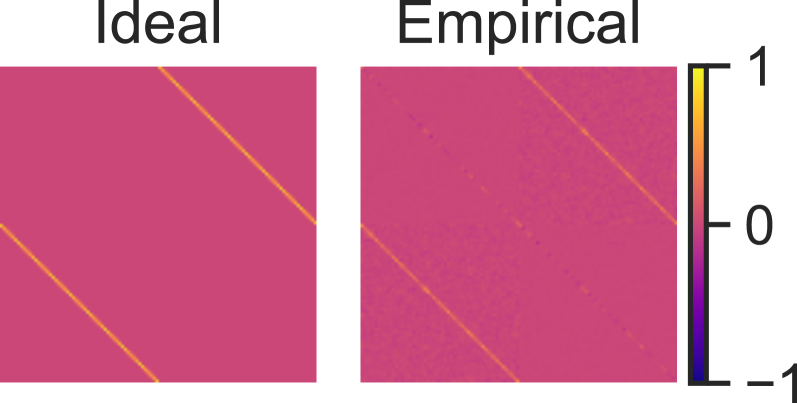
## Heatmap: Ideal vs Empirical Data Comparison
### Overview
The image presents a side-by-side comparison of two panels labeled "Ideal" (left) and "Empirical" (right), both rendered as heatmaps with a shared color scale. The panels use a magenta-to-purple gradient background with overlaid lines, suggesting a spatial or relational analysis. A vertical color scale on the right quantifies values from -1 (purple) to 1 (yellow), with orange as the midpoint.
### Components/Axes
- **Panels**:
- **Ideal**: Left panel with two solid orange diagonal lines crossing from top-left to bottom-right.
- **Empirical**: Right panel with two dashed orange diagonal lines and localized purple regions (indicating lower values).
- **Color Scale**: Vertical gradient from purple (-1) to yellow (1), positioned on the right edge of both panels.
- **Legend**: Implicitly defined by the color scale; no explicit labels beyond the numerical range.
### Detailed Analysis
- **Ideal Panel**:
- Solid orange lines dominate, evenly spaced and uninterrupted.
- No color variation in the background, suggesting uniform values (likely near 0, the midpoint of the scale).
- **Empirical Panel**:
- Dashed orange lines mirror the Ideal's trajectory but with irregular spacing.
- Purple regions (value ≈ -1) appear in clusters, particularly in the lower-left and upper-right quadrants.
- Orange lines intersect purple areas, indicating localized deviations from the Ideal.
### Key Observations
1. **Consistency vs. Variability**: The Ideal panel shows perfect alignment, while the Empirical panel exhibits irregularities in both line placement and color intensity.
2. **Deviation Patterns**: Purple regions in the Empirical panel correlate with areas where dashed lines diverge most from the Ideal's solid lines.
3. **Scale Interpretation**: The color scale implies that values closer to 0 (orange) represent ideal conditions, while extremes (-1/purple and 1/yellow) indicate significant deviations.
### Interpretation
The image contrasts a theoretical "Ideal" state (uniform, consistent relationships) with empirical data (real-world variability). The dashed lines in the Empirical panel likely represent measured or observed data points that imperfectly replicate the Ideal's solid lines. The purple regions highlight areas of greatest discrepancy, possibly due to measurement noise, environmental factors, or model limitations. The shared color scale emphasizes that deviations are quantified, with purple (-1) representing the most severe underperformance relative to the Ideal. This visualization underscores the gap between theoretical models and practical implementations, suggesting opportunities for refinement in data collection or modeling approaches.