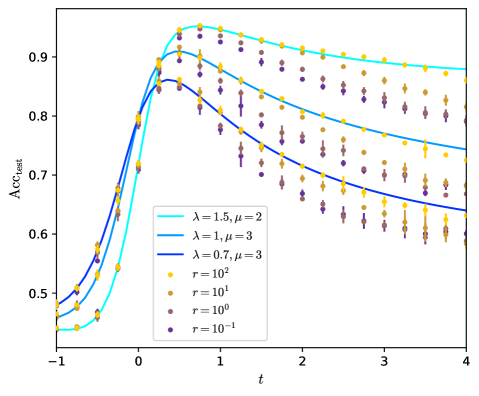
## Chart: Accuracy vs. Time for Different Parameters
### Overview
The image is a line chart showing the test accuracy (Acc_test) of a model over time (t) for different values of parameters lambda (λ), mu (µ), and r. The chart displays how the accuracy changes as time progresses, with separate lines and scatter plots representing different parameter settings.
### Components/Axes
* **X-axis (Horizontal):** 't' representing time, ranging from -1 to 4. Axis markers are present at -1, 0, 1, 2, 3, and 4.
* **Y-axis (Vertical):** 'Acc_test' representing test accuracy, ranging from 0.5 to 0.9. Axis markers are present at 0.5, 0.6, 0.7, 0.8, and 0.9.
* **Legend (Left Side):**
* Cyan: λ = 1.5, µ = 2
* Blue: λ = 1, µ = 3
* Dark Blue: λ = 0.7, µ = 3
* Yellow: r = 10^2
* Olive: r = 10^1
* Brown: r = 10^0
* Purple: r = 10^-1
### Detailed Analysis
**Lambda and Mu Series (Lines):**
* **λ = 1.5, µ = 2 (Cyan):** The line starts at approximately 0.48 at t = -1, rises sharply to approximately 0.93 at t = 0.5, and then gradually decreases to approximately 0.88 at t = 4.
* **λ = 1, µ = 3 (Blue):** The line starts at approximately 0.45 at t = -1, rises sharply to approximately 0.87 at t = 0.5, and then gradually decreases to approximately 0.75 at t = 4.
* **λ = 0.7, µ = 3 (Dark Blue):** The line starts at approximately 0.43 at t = -1, rises sharply to approximately 0.85 at t = 0.5, and then gradually decreases to approximately 0.65 at t = 4.
**R Series (Scatter Plots):**
* **r = 10^2 (Yellow):** The scatter plot starts at approximately 0.5 at t = -1, rises sharply to approximately 0.95 at t = 0.5, and then gradually decreases to approximately 0.75 at t = 4.
* **r = 10^1 (Olive):** The scatter plot starts at approximately 0.48 at t = -1, rises sharply to approximately 0.9 at t = 0.5, and then gradually decreases to approximately 0.7 at t = 4.
* **r = 10^0 (Brown):** The scatter plot starts at approximately 0.45 at t = -1, rises sharply to approximately 0.85 at t = 0.5, and then gradually decreases to approximately 0.65 at t = 4.
* **r = 10^-1 (Purple):** The scatter plot starts at approximately 0.43 at t = -1, rises sharply to approximately 0.8 at t = 0.5, and then gradually decreases to approximately 0.6 at t = 4.
### Key Observations
* All lines and scatter plots show a similar trend: a rapid increase in accuracy from t = -1 to t = 0.5, followed by a gradual decrease from t = 0.5 to t = 4.
* Higher values of lambda and mu generally lead to higher peak accuracy.
* Higher values of r generally lead to higher accuracy throughout the time range.
* The scatter plots have error bars, indicating the variability in the accuracy for each value of r at each time point.
### Interpretation
The chart illustrates the impact of different parameter settings (λ, µ, and r) on the test accuracy of a model over time. The initial rapid increase in accuracy suggests a learning phase, while the subsequent decrease indicates potential overfitting or a decay in performance as time progresses. The parameters λ, µ, and r appear to influence both the peak accuracy achieved and the rate at which the accuracy decreases over time. The error bars on the scatter plots suggest that the parameter 'r' may introduce some variability in the model's performance. The data suggests that optimizing these parameters is crucial for achieving and maintaining high test accuracy.