\n
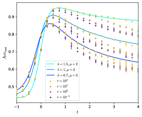
## Line Chart with Scatter Points: Accuracy Over Time for Different Parameters
### Overview
The image is a technical line chart with overlaid scatter points, plotting a metric labeled "Acc_int" (likely "Internal Accuracy") against a variable "t" (likely time or a time-like parameter). The chart compares the performance of three distinct model configurations (represented by lines) across four different resolution or scale parameters (represented by scatter points). The overall trend shows an initial rapid increase in accuracy, a peak, followed by a gradual decline.
### Components/Axes
* **X-Axis:** Labeled **"t"**. The scale is linear, ranging from **-1 to 4**, with major tick marks at integer intervals (-1, 0, 1, 2, 3, 4).
* **Y-Axis:** Labeled **"Acc_int"**. The scale is linear, ranging from **0.5 to approximately 0.95**, with major tick marks at 0.1 intervals (0.5, 0.6, 0.7, 0.8, 0.9).
* **Legend (Bottom-Left Quadrant):** Contains two sections.
* **Line Series (Solid Lines):**
* Cyan Line: **λ = 1.5, μ = 2**
* Medium Blue Line: **λ = 1, μ = 3**
* Dark Blue Line: **λ = 0.7, μ = 3**
* **Scatter Point Series (Markers):**
* Yellow Circle: **r = 10²**
* Gold Circle: **r = 10¹**
* Brown Circle: **r = 10⁰**
* Purple Circle: **r = 10⁻¹**
### Detailed Analysis
**1. Line Series Trends (Model Configurations):**
* **Cyan Line (λ=1.5, μ=2):** Starts lowest at t=-1 (~0.45), rises most steeply, peaks highest (~0.94 at t≈0.7), and decays the slowest, remaining the highest line for t > 1.
* **Medium Blue Line (λ=1, μ=3):** Starts at ~0.48 at t=-1, peaks at ~0.91 at t≈0.5, and decays at a moderate rate.
* **Dark Blue Line (λ=0.7, μ=3):** Starts highest at t=-1 (~0.50), peaks at ~0.86 at t≈0.4 (the earliest peak), and decays the fastest, becoming the lowest line for t > 1.5.
**2. Scatter Point Series Trends (Resolution/Scale 'r'):**
* **Yellow (r=10²):** Points generally lie closest to the cyan line, especially after the peak. They show the highest accuracy values among scatter points for t > 0.5.
* **Gold (r=10¹):** Points cluster near the medium blue line. Their values are consistently below the yellow points but above the brown/purple points for t > 0.
* **Brown (r=10⁰) & Purple (r=10⁻¹):** These points are tightly clustered together, generally lying below the gold points and following the trend of the dark blue line most closely. They exhibit the lowest accuracy values, particularly for t > 1. The distinction between brown and purple points is minimal.
**3. Data Point Approximations (Selected):**
* At **t = -1**: Acc_int ranges from ~0.45 (cyan line) to ~0.50 (dark blue line). Scatter points are between ~0.47 and ~0.51.
* At **Peak (t ≈ 0.5-0.7)**: Maximum Acc_int is ~0.94 (cyan line). Scatter points peak between ~0.85 (purple/brown) and ~0.93 (yellow).
* At **t = 4**: Acc_int ranges from ~0.64 (dark blue line) to ~0.88 (cyan line). Scatter points range from ~0.58 (purple) to ~0.87 (yellow).
### Key Observations
1. **Parameter Sensitivity:** The model configuration (λ, μ) has a dominant effect on the overall accuracy trajectory (peak height and decay rate). Higher λ with lower μ (cyan line) yields higher sustained accuracy.
2. **Resolution Impact:** The scale parameter 'r' creates a clear stratification in performance. Higher 'r' (10², yellow) consistently yields higher accuracy than lower 'r' (10⁰, 10⁻¹), especially in the post-peak regime (t > 1).
3. **Convergence of Low 'r':** The performance difference between r=10⁰ (brown) and r=10⁻¹ (purple) is negligible, suggesting a diminishing return or a performance floor as 'r' decreases below 1.
4. **Temporal Dynamics:** All configurations show a similar qualitative pattern: a rapid learning/improvement phase (t < 0.5), an optimal point, and a subsequent degradation phase. The rate of degradation is controlled by the model parameters.
### Interpretation
This chart likely illustrates the **stability-performance trade-off** in a dynamic system, such as a neural network training process, a simulation, or a control system. The variable 't' could represent training time, simulation steps, or a perturbation magnitude.
* **What the data suggests:** The system's internal accuracy ("Acc_int") is not static. It improves to an optimal point and then deteriorates, possibly due to overfitting, instability, or accumulating error. The parameters λ and μ control this dynamic: a higher λ (perhaps a learning rate or gain) combined with a lower μ (perhaps a damping or regularization factor) leads to a higher but potentially less stable peak (cyan line). The 'r' parameter likely represents model resolution, data granularity, or resource allocation. Higher 'r' provides better accuracy, acting as a buffer against the degradation seen at lower 'r'.
* **Relationship between elements:** The lines represent the *theoretical* or *expected* behavior for given (λ, μ) pairs. The scatter points represent *empirical* results at different operational scales 'r'. The close alignment of yellow points (high 'r') with the cyan line (high-performance parameters) suggests that sufficient resources (high 'r') are needed to realize the potential of aggressive parameter settings. Conversely, low 'r' forces all configurations toward a lower, similar performance baseline.
* **Notable Anomaly:** The dark blue line (λ=0.7, μ=3) starts with the highest accuracy at t=-1 but ends with the lowest. This indicates a configuration that is initially robust but lacks long-term stability or adaptability, making it unsuitable for processes extending beyond t≈1.5. The chart provides a visual guide for selecting parameters (λ, μ) and resources ('r') based on the desired operational timeframe 't'.