## Diagram: Training and Testing Sets with Distribution Shift
### Overview
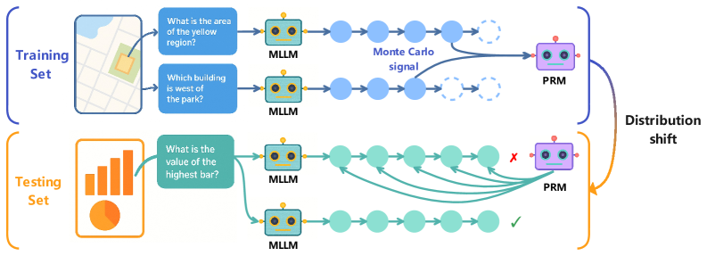
The image illustrates a diagram comparing a training set and a testing set, highlighting a distribution shift between them. The diagram shows how questions are processed by a Multi-Layer Language Model (MLLM) and a Probabilistic Reasoning Model (PRM). The training set uses map-based questions, while the testing set uses a bar graph question.
### Components/Axes
* **Training Set:** Located in the top half of the image, enclosed by a blue bracket.
* **Input:** A map image with a yellow region and a question: "What is the area of the yellow region?"
* **Input:** A map image with a park and a question: "Which building is west of the park?"
* **MLLM:** A robot icon labeled "MLLM" processes the questions.
* **Monte Carlo signal:** A label pointing to a split in the processing path.
* **PRM:** A robot icon labeled "PRM" receives the processed information.
* **Testing Set:** Located in the bottom half of the image, enclosed by an orange bracket.
* **Input:** A bar graph image with a question: "What is the value of the highest bar?"
* **MLLM:** A robot icon labeled "MLLM" processes the question.
* **PRM:** A robot icon labeled "PRM" receives the processed information. One PRM has a red "X" indicating an incorrect result, while the other has a green checkmark indicating a correct result.
* **Distribution Shift:** A curved line connecting the training and testing sets, labeled "Distribution shift". The top half of the line is blue, and the bottom half is orange.
### Detailed Analysis or ### Content Details
* **Training Set Processing:**
* The map-based questions are fed into the MLLM.
* The MLLM outputs a series of blue circles, representing processing steps.
* The "Monte Carlo signal" indicates a branching path, with some paths leading to dashed circles.
* The final output is fed into the PRM.
* **Testing Set Processing:**
* The bar graph question is fed into the MLLM.
* The MLLM outputs a series of teal circles, representing processing steps.
* Multiple paths converge towards the PRM.
* One PRM gives an incorrect result (marked with a red "X"), while the other gives a correct result (marked with a green checkmark).
### Key Observations
* The training set uses map-based questions, while the testing set uses a bar graph question, indicating a change in the type of input data.
* The "Monte Carlo signal" in the training set suggests a probabilistic approach to processing the information.
* The incorrect result in the testing set highlights the challenges of applying a model trained on one distribution to a different distribution.
### Interpretation
The diagram illustrates the concept of distribution shift, where a model trained on one type of data (the training set) performs poorly on a different type of data (the testing set). The change from map-based questions to bar graph questions represents this shift. The incorrect result in the testing set demonstrates the impact of distribution shift on model performance. The diagram suggests that the model may need to be adapted or retrained to handle the new distribution effectively. The Monte Carlo signal in the training set suggests that the model uses a probabilistic approach to reasoning, which may be sensitive to changes in the input distribution.