## Diagram: Machine Learning Model Performance Under Distribution Shift
### Overview
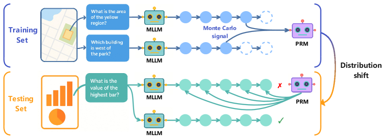
The diagram illustrates the workflow and performance of a machine learning system (MLLM) and a prediction refinement module (PRM) across training and testing phases. It highlights how distribution shifts affect model accuracy, using visual metaphors like arrows, color-coded components, and error markers.
---
### Components/Axes
1. **Training Set (Blue)**
- **Input**: Map visualization with questions:
- "What is the area of the yellow region?"
- "Which building is west of the park?"
- **Process**:
- MLLM (blue robot) processes spatial queries.
- Outputs connect to PRM via "Monte Carlo signal" (dashed blue line).
- **Output**: PRM (purple robot) refines predictions.
2. **Testing Set (Orange)**
- **Input**: Bar chart visualization with question:
- "What is the value of the highest bar?"
- **Process**:
- MLLM (green robot) processes numerical data.
- Outputs connect to PRM via multiple paths (solid green lines).
- **Output**: PRM evaluates predictions with mixed results:
- ✅ Correct answers (green checkmark).
- ❌ Errors (red "X").
3. **Distribution Shift**
- Arrows (orange) indicate a shift from training to testing data.
- PRM performance degrades in testing due to this shift.
---
### Detailed Analysis
- **Training Set Flow**:
- MLLM processes map-based spatial reasoning tasks.
- PRM refines predictions using Monte Carlo methods (probabilistic sampling).
- No errors observed in training.
- **Testing Set Flow**:
- MLLM handles bar chart data (numerical reasoning).
- PRM encounters distribution shift, leading to:
- 3 correct predictions (✅).
- 2 incorrect predictions (❌).
- Green lines show multiple pathways for PRM to process testing data.
- **Color Coding**:
- Blue (Training): Spatial reasoning, Monte Carlo signal.
- Orange (Testing): Numerical reasoning, distribution shift.
- Purple (PRM): Central refinement module.
- Green (Testing MLLM): Adaptation to new data types.
---
### Key Observations
1. **Performance Degradation**:
- PRM accuracy drops in testing (2/5 errors) compared to training (0/2).
- Distribution shift introduces ambiguity in bar chart interpretation.
2. **Model Adaptability**:
- MLLM retains core functionality across data types (map → bar chart).
- PRM struggles with novel data distributions despite training.
3. **Visual Metaphors**:
- Dashed lines (Monte Carlo) vs. solid lines (testing pathways) suggest differing confidence levels.
- Error markers (❌) and checkmarks (✅) quantify shift impact.
---
### Interpretation
The diagram demonstrates how distribution shifts challenge machine learning systems. While the MLLM adapts to new data formats (map to bar chart), the PRM’s reliance on training-specific patterns (Monte Carlo signals) fails under novel conditions. This highlights the need for robust generalization techniques, such as domain adaptation or ensemble methods, to mitigate performance drops in real-world scenarios. The use of color and error markers effectively visualizes the trade-off between model complexity and adaptability.