\n
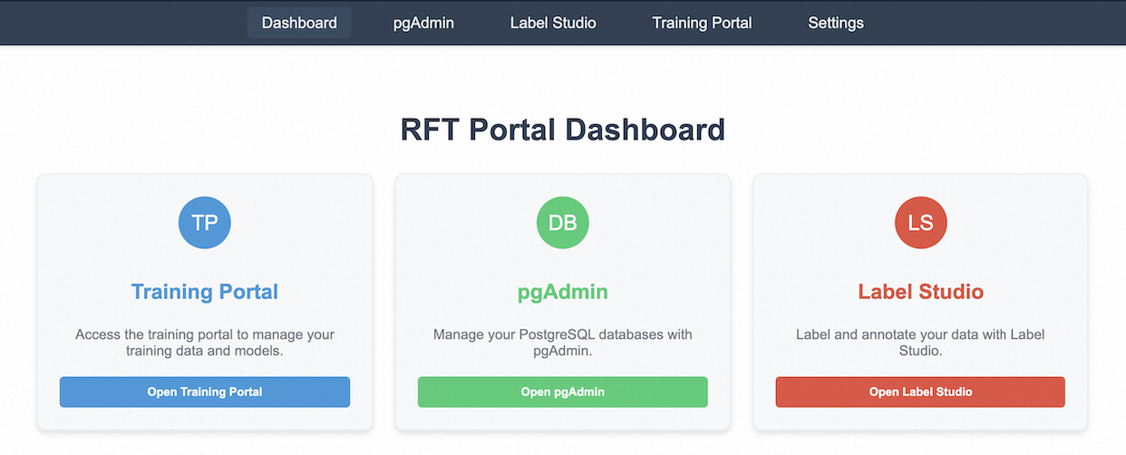
## Screenshot: RFT Portal Dashboard
### Overview
The image is a screenshot of a web-based dashboard interface, likely for a data science or machine learning project. It presents three main sections: Training Portal, pgAdmin, and Label Studio, each represented by a card-like element. A top navigation bar provides access to other sections of the portal.
### Components/Axes
The top navigation bar contains the following links, from left to right:
* Dashboard
* pgAdmin
* Label Studio
* Training Portal
* Settings
The main body of the screenshot consists of three cards, arranged horizontally. Each card contains:
* A circular icon with two-letter abbreviation.
* A title.
* A short description.
* A button.
### Content Details
**Card 1: Training Portal**
* Icon: "TP" (in a blue circle)
* Title: Training Portal
* Description: "Access the training portal to manage your training data and models."
* Button: "Open Training Portal" (blue button)
**Card 2: pgAdmin**
* Icon: "DB" (in a green circle)
* Title: pgAdmin
* Description: "Manage your PostgreSQL databases with pgAdmin."
* Button: "Open pgAdmin" (green button)
**Card 3: Label Studio**
* Icon: "LS" (in a red circle)
* Title: Label Studio
* Description: "Label and annotate your data with Label Studio."
* Button: "Open Label Studio" (red button)
The main title of the dashboard is "RFT Portal Dashboard", displayed prominently at the top center of the screen.
### Key Observations
The dashboard provides quick access to key tools for a data science workflow: data labeling (Label Studio), database management (pgAdmin), and model training (Training Portal). The color-coding of the cards (blue, green, red) and buttons may be intended to visually differentiate the tools. The abbreviations "TP", "DB", and "LS" are used as icons for each tool.
### Interpretation
This dashboard appears to be designed for users involved in the development and deployment of machine learning models. It centralizes access to essential tools for data preparation, model training, and database management. The "RFT" in the dashboard title likely refers to the project or organization name. The interface is clean and intuitive, suggesting a focus on usability. The dashboard's layout and functionality indicate a streamlined workflow for managing the entire machine learning lifecycle.