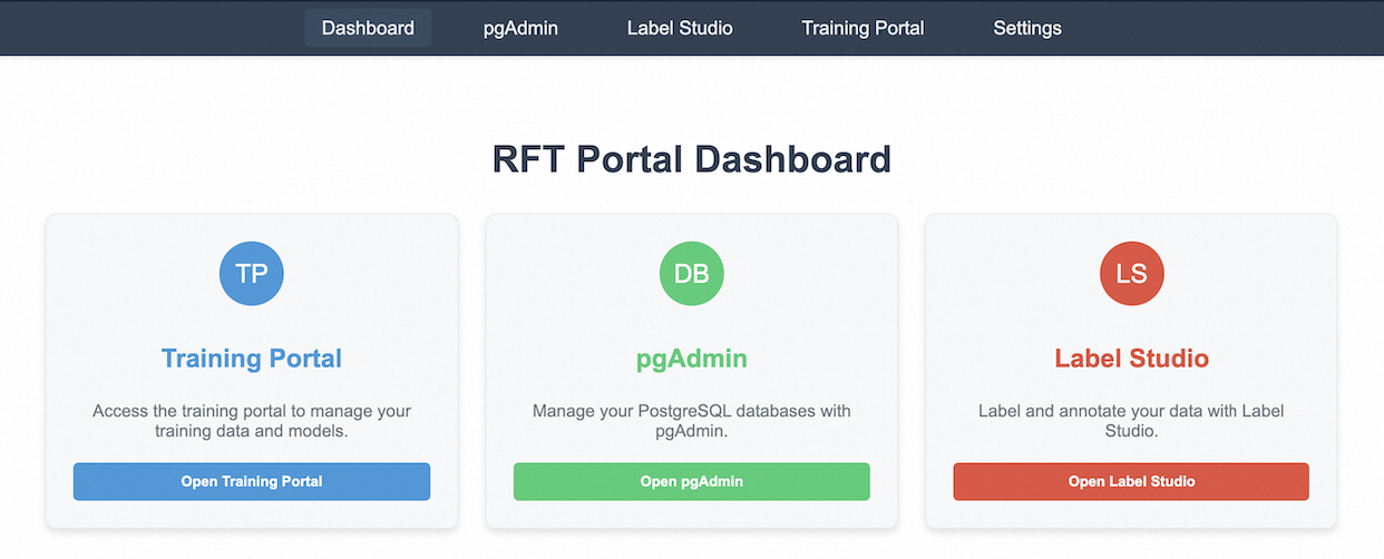
## Screenshot: RFT Portal Dashboard Interface
### Overview
The image depicts a user interface for an RFT (Rapid Feature Training) Portal Dashboard. The layout is structured as a responsive grid with three primary functional sections aligned horizontally. A dark navigation bar spans the top, containing tabs for navigation, while the main content area features interactive buttons and descriptive text blocks.
### Components/Axes
1. **Navigation Bar (Top)**
- Tabs: `Dashboard` (highlighted), `pgAdmin`, `Label Studio`, `Training Portal`, `Settings`
- Background: Dark blue (#2c3e50)
- Text Color: White
2. **Main Content Area**
- **Title**: "RFT Portal Dashboard" (Centered, bold, dark gray)
- **Three Functional Sections** (Equal-width columns):
- **Training Portal** (Left)
- Icon: Blue circle with "TP" (White text)
- Button: "Open Training Portal" (Blue, rounded rectangle)
- Description: "Access the training portal to manage your training data and models."
- **pgAdmin** (Center)
- Icon: Green circle with "DB" (White text)
- Button: "Open pgAdmin" (Green, rounded rectangle)
- Description: "Manage your PostgreSQL databases with pgAdmin."
- **Label Studio** (Right)
- Icon: Red circle with "LS" (White text)
- Button: "Open Label Studio" (Red, rounded rectangle)
- Description: "Label and annotate your data with Label Studio."
### Detailed Analysis
- **Navigation Bar**: The `Dashboard` tab is visually distinguished by a darker shade of blue, indicating it is the active view. Other tabs are uniformly styled with white text on a dark blue background.
- **Functional Sections**:
- **Training Portal**: Positioned leftmost, uses blue branding (icon and button) to signify its association with data/model management.
- **pgAdmin**: Central section, green branding aligns with database management themes.
- **Label Studio**: Rightmost section, red branding emphasizes data annotation tasks.
- **Buttons**: Each section includes a prominently styled button with matching color to its icon, ensuring visual consistency and intuitive navigation.
### Key Observations
- **Color Coding**: Each functional section uses a distinct primary color (blue, green, red) to differentiate its purpose, aiding user recognition.
- **Button Placement**: Buttons are centrally aligned within their respective sections, drawing immediate attention.
- **Text Hierarchy**: Descriptions are concise and positioned below buttons, ensuring clarity without visual clutter.
### Interpretation
The dashboard is designed for administrative and data management tasks, with a clear separation of responsibilities across the three sections. The use of color coding and consistent button styling suggests an emphasis on usability, allowing users to quickly identify and access tools for training data management (Training Portal), database administration (pgAdmin), and data labeling (Label Studio). The absence of numerical data or dynamic visualizations implies this is a static interface for tool access rather than data analysis. The structure prioritizes simplicity, likely targeting users who require direct interaction with backend systems rather than exploratory data analysis.