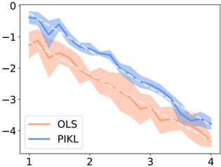
## Chart: OLS vs PIKL Performance
### Overview
The image presents a line chart comparing the performance of two methods, OLS and PIKL, likely in a regression or prediction task. The chart displays the average performance of each method along with a shaded region indicating the variability or uncertainty around the average. The x-axis represents some parameter or condition, while the y-axis represents the performance metric.
### Components/Axes
* **X-axis:** Ranges from 1 to 4, with tick marks at each integer value.
* **Y-axis:** Ranges from 0 to -4, with tick marks at each integer value.
* **Legend:** Located in the bottom-left corner.
* **OLS:** Represented by an orange line and shaded region.
* **PIKL:** Represented by a blue line and shaded region.
### Detailed Analysis
* **OLS (Orange):**
* The orange line starts at approximately -1.3 at x=1 and decreases to approximately -4.3 at x=4.
* The shaded orange region represents the variability around the OLS performance.
* **PIKL (Blue):**
* The blue line starts at approximately -0.7 at x=1 and decreases to approximately -3.7 at x=4.
* The shaded blue region represents the variability around the PIKL performance.
* **Dashed White Lines:**
* There are dashed white lines that seem to follow the trend of both the OLS and PIKL lines. These likely represent a smoothed or underlying trend.
### Key Observations
* Both OLS and PIKL show a decreasing trend in performance as the x-axis value increases.
* PIKL generally outperforms OLS across the entire range of x-values, as its line is consistently higher (less negative) than the OLS line.
* The variability (shaded regions) appears to increase as the x-axis value increases for both methods.
### Interpretation
The chart suggests that both OLS and PIKL methods experience a decline in performance as the condition represented by the x-axis changes. However, PIKL consistently demonstrates better performance than OLS across the observed range. The increasing variability with higher x-values indicates that the performance of both methods becomes less predictable or more sensitive to other factors as the x-axis value increases. The dashed white lines may represent a theoretical or expected performance trend, while the actual lines show the empirical performance.