## Line Graph: Exact Match (%) vs SFT Ratio (×10⁻⁴)
### Overview
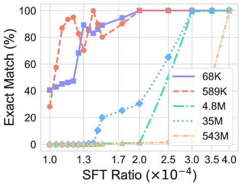
The graph depicts the relationship between SFT Ratio (scaled by 10⁻⁴) and Exact Match (%) for five distinct data series, each represented by unique line styles, colors, and markers. The y-axis ranges from 0% to 100%, while the x-axis spans 1.0 to 4.0 (×10⁻⁴). The legend in the top-right corner maps line styles/colors to labels (e.g., "68K," "589K," etc.).
---
### Components/Axes
- **X-axis**: "SFT Ratio (×10⁻⁴)" with ticks at 1.0, 1.3, 1.7, 2.0, 2.5, 3.0, 3.5, 4.0.
- **Y-axis**: "Exact Match (%)" with ticks at 0%, 20%, 40%, 60%, 80%, 100%.
- **Legend**: Located in the top-right corner, with five entries:
- **68K**: Solid blue line with square markers.
- **589K**: Dashed red line with circular markers.
- **4.8M**: Dotted green line with diamond markers.
- **35M**: Dotted blue line with triangular markers.
- **543M**: Dash-dot orange line with cross markers.
---
### Detailed Analysis
1. **68K (Solid Blue, Squares)**:
- Starts at ~40% at x=1.0.
- Rises sharply to ~90% by x=1.3.
- Plateaus at ~95-100% from x=1.7 onward.
- **Trend**: Steep initial increase, then stabilization.
2. **589K (Dashed Red, Circles)**:
- Begins at ~30% at x=1.0.
- Increases to ~90% by x=1.3.
- Plateaus at ~95-100% from x=1.7 onward.
- **Trend**: Similar to 68K but with a slower initial rise.
3. **4.8M (Dotted Green, Diamonds)**:
- Remains near 0% until x=2.0.
- Rises sharply to 100% by x=2.5.
- **Trend**: Delayed, abrupt increase.
4. **35M (Dotted Blue, Triangles)**:
- Stays near 0% until x=2.5.
- Rises sharply to 100% by x=3.5.
- **Trend**: Even later and steeper increase than 4.8M.
5. **543M (Dash-Dot Orange, Crosses)**:
- Remains near 0% until x=3.5.
- Rises sharply to 100% by x=4.0.
- **Trend**: Latest and most gradual increase.
---
### Key Observations
- **Early Performance**: Smaller models (68K, 589K) achieve high Exact Match (%) at lower SFT Ratios.
- **Delayed Scaling**: Larger models (4.8M, 35M, 543M) require significantly higher SFT Ratios to reach 100% performance.
- **Inverse Relationship**: Larger model sizes correlate with higher SFT Ratios needed for optimal performance.
- **Outliers**: The 543M line (orange) is the only one reaching 100% at x=4.0, suggesting a threshold effect.
---
### Interpretation
The data suggests that smaller models (e.g., 68K, 589K) are more efficient, achieving high Exact Match (%) with minimal SFT Ratio. Larger models (e.g., 543M) require disproportionately higher SFT Ratios, indicating potential inefficiencies or trade-offs in scaling. The abrupt plateaus for smaller models imply a saturation point, while the delayed increases for larger models may reflect computational or architectural limitations. The 543M line’s late rise highlights a possible "breakpoint" where scaling benefits diminish, necessitating further optimization or alternative strategies for larger systems.