## Scatter Plot: Model Performance vs. Computational Cost
### Overview
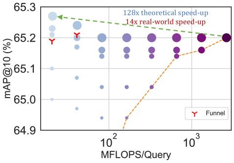
The image is a scatter plot comparing the performance of various models or configurations, measured by mean Average Precision at 10 (mAP@10), against their computational cost in MFLOPS per query. The plot includes two annotated trend lines and uses circle size and color to encode additional dimensions of data.
### Components/Axes
* **Y-Axis:** Labeled **"mAP@10 (%)"**. The scale is linear, ranging from approximately 64.9% to 65.3%, with major tick marks at 64.9, 65.0, 65.1, 65.2, and 65.3.
* **X-Axis:** Labeled **"MFLOPS/Query"**. The scale is **logarithmic**, with major tick marks labeled at **10²** (100) and **10³** (1000). Minor ticks are visible between these values.
* **Legend:** Located in the **bottom-right corner**. It contains a single entry: a red funnel icon labeled **"Funnel"**.
* **Data Points:** Represented as circles. Their **size** varies significantly, likely representing a third variable (e.g., model size, number of parameters, or inference latency). Their **color** follows a gradient from light blue (left side) to dark purple (right side), which may correlate with the x-axis value (MFLOPS) or another categorical variable.
* **Annotations:**
* A **green dashed line** with an arrow pointing left, labeled **"128x theoretical speed-up"**. It originates near the top-left cluster of points and slopes gently downward to the right.
* An **orange dashed line** with an arrow pointing right, labeled **"14x real-world speed-up"**. It originates from the bottom-center and slopes steeply upward to the right.
* Two red **funnel icons** (matching the legend) are placed on the plot: one near the top-left (approx. 65.2% mAP, ~100 MFLOPS) and another slightly to its right.
### Detailed Analysis
* **Data Distribution:** The data points form a broad, scattered cloud. There is a dense cluster of points in the **top-left quadrant** (high mAP ~65.15-65.25%, low MFLOPS ~100-200). Points become more sparse and spread out as MFLOPS increase towards 1000.
* **Trend Lines:**
* **Green Line (128x theoretical speed-up):** This line suggests a theoretical relationship where a massive reduction in computation (128x) corresponds to a very slight decrease in mAP (from ~65.25% to ~65.20% across the plotted range). The trend is nearly flat, indicating minimal theoretical performance loss for large computational savings.
* **Orange Line (14x real-world speed-up):** This line shows a strong positive correlation. It starts at a low mAP (~64.9% at ~200 MFLOPS) and rises sharply to meet the main cluster of points at higher MFLOPS (~65.2% at ~1000 MFLOPS). This indicates that in practice, achieving a 14x speed-up (moving left along this line) comes with a significant performance penalty.
* **Circle Size & Color:** The largest circles are predominantly in the **top-left** and **top-right** areas. The color gradient from light blue to dark purple generally follows the x-axis from left to right.
### Key Observations
1. **Performance-Compute Trade-off:** The plot visualizes the trade-off between accuracy (mAP) and computational cost (MFLOPS). The highest-performing models (top of the y-axis) are not necessarily the most computationally expensive.
2. **Theoretical vs. Real-World Gap:** There is a stark contrast between the theoretical (green) and real-world (orange) speed-up lines. The theoretical line is optimistic, showing almost no performance loss for extreme speed-ups, while the real-world line shows a steep performance drop for more modest speed-ups.
3. **Cluster of Efficient Models:** A notable cluster of models exists in the **top-left**, offering high mAP (~65.2%) at relatively low MFLOPS (~100-200). The "Funnel" icons are placed within or near this cluster, possibly highlighting these as Pareto-optimal or particularly efficient configurations.
4. **Outliers:** Several data points with very low mAP (<65.0%) exist at moderate MFLOPS (~200-400), representing underperforming models. Conversely, a few points achieve high mAP at very high MFLOPS (~1000), but with diminishing returns.
### Interpretation
This chart is likely from a research paper or technical report on efficient deep learning model design, possibly for computer vision tasks (given the mAP metric). It argues that while theoretical calculations might suggest enormous speed-ups are "free," practical implementation reveals a significant accuracy cost.
The **"Funnel"** annotation likely refers to a specific model architecture or technique (e.g., a funnel-shaped network, knowledge distillation, or pruning method) that successfully navigates this trade-off. The placement of the funnel icons suggests this method achieves a favorable balance—high accuracy in the low-compute regime.
The core message is one of **pragmatic optimization**: the pursuit of real-world efficiency (the orange line's direction) requires careful balancing, as naive reductions in computation lead to sharp performance declines. The scattered points represent the search space of possible model configurations, with the top-left cluster representing the most desirable "sweet spot" for deployment on resource-constrained devices. The large circle sizes in this area may indicate that these efficient models are also robust or have other favorable properties.