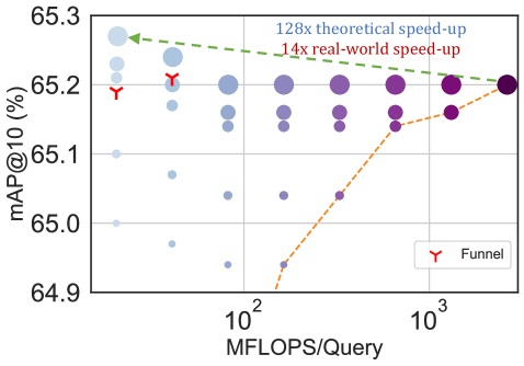
## Scatter Plot: mAP@10 vs MFLOPS/Query
### Overview
The image is a scatter plot showing the relationship between mAP@10 (mean Average Precision at 10) and MFLOPS/Query (Millions of Floating Point Operations per Query). The plot includes data points represented by circles of varying sizes and colors, a dashed line representing the "Funnel" data series, and annotations indicating theoretical and real-world speed-ups.
### Components/Axes
* **X-axis:** MFLOPS/Query. The scale is logarithmic, with marked values at 10<sup>2</sup> and 10<sup>3</sup>.
* **Y-axis:** mAP@10 (%). The scale ranges from 64.9 to 65.3.
* **Data Points:** Circles of varying sizes and colors, ranging from light blue to dark purple. The color gradient likely represents another dimension of data.
* **Legend:** Located in the bottom-right corner. It identifies the red inverted triangle as "Funnel".
* **Annotations:**
* "128x theoretical speed-up" (blue) - indicated by a dashed green arrow pointing to the top-left data points.
* "14x real-world speed-up" (red) - indicated by a dashed green arrow pointing to the top-left data points.
* **Funnel Data Series:** Represented by a dashed orange line connecting red inverted triangle markers.
### Detailed Analysis
* **X-Axis Values:** The x-axis is logarithmic. The values shown are 10<sup>2</sup> (100) and 10<sup>3</sup> (1000).
* **Y-Axis Values:** The y-axis ranges from 64.9% to 65.3%. Major tick marks are at 64.9, 65.0, 65.1, 65.2, and 65.3.
* **Data Point Distribution:** The data points are clustered in vertical columns at different MFLOPS/Query values. The size and color of the circles vary within each column.
* **Funnel Data Series:**
* The "Funnel" data series (orange dashed line with red inverted triangle markers) starts at approximately (100, 64.93) and increases to approximately (1000, 65.2).
* The trend of the Funnel data series is upward.
* **Theoretical Speed-up:** The "128x theoretical speed-up" annotation points to the cluster of data points in the top-left corner of the plot.
* **Real-world Speed-up:** The "14x real-world speed-up" annotation also points to the cluster of data points in the top-left corner of the plot.
### Key Observations
* The mAP@10 values generally increase as MFLOPS/Query increases, as indicated by the "Funnel" data series.
* There is a wide range of mAP@10 values for each MFLOPS/Query value, as shown by the vertical distribution of data points.
* The size and color of the data points vary, suggesting additional dimensions of data that are not explicitly labeled.
### Interpretation
The plot illustrates the trade-off between computational cost (MFLOPS/Query) and accuracy (mAP@10). The "Funnel" data series suggests that increasing computational cost generally leads to higher accuracy. However, the wide distribution of data points indicates that other factors also influence accuracy. The annotations regarding theoretical and real-world speed-up suggest that there are potential optimizations that can improve performance. The difference between the theoretical and real-world speed-up indicates that there are limitations in achieving the full potential of these optimizations.