\n
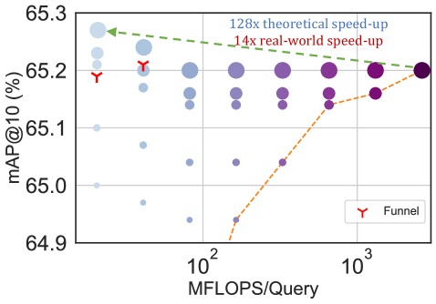
## Scatter Plot: mAP@10 vs. MFLOPS/Query
### Overview
This scatter plot visualizes the relationship between mAP@10 (mean Average Precision at 10) and MFLOPS/Query (Millions of Floating Point Operations Per Second per Query). The plot includes two data series represented by different colored scatter points and trend lines, along with annotations indicating theoretical and real-world speed-up factors. A specific data point is highlighted with a "Funnel" label.
### Components/Axes
* **X-axis:** MFLOPS/Query, ranging from approximately 10^2 to 10^3 (logarithmic scale).
* **Y-axis:** mAP@10 (%), ranging from approximately 64.9 to 65.3.
* **Data Series 1 (Blue):** Represents "128x theoretical speed-up" with a dashed green line.
* **Data Series 2 (Orange):** Represents "14x real-world speed-up" with a dashed orange line.
* **Legend:** Located in the bottom-right corner, identifying the "Funnel" marker (orange 'Y' symbol).
* **Scatter Points:** Various shades of blue and purple, representing individual data points.
### Detailed Analysis
**X-axis:** The x-axis is labeled "MFLOPS/Query" and uses a logarithmic scale. The tick marks are at 10^2 and 10^3.
**Y-axis:** The y-axis is labeled "mAP@10 (%)" and ranges from 64.9 to 65.3, with gridlines at 0.1 intervals.
**Data Series 1 (Blue - 128x theoretical speed-up):**
The trend line slopes downward slightly.
* Approximately at MFLOPS/Query = 10^2, mAP@10 is approximately 65.25%.
* Approximately at MFLOPS/Query = 10^3, mAP@10 is approximately 65.2%.
**Data Series 2 (Orange - 14x real-world speed-up):**
The trend line slopes upward significantly.
* Approximately at MFLOPS/Query = 10^2, mAP@10 is approximately 64.95%.
* Approximately at MFLOPS/Query = 10^3, mAP@10 is approximately 65.2%.
**Scatter Points:**
* There are numerous scatter points distributed across the plot.
* The points generally cluster around the trend lines, but with considerable variance.
* A specific point is marked with an orange 'Y' symbol and labeled "Funnel". This point is located at approximately MFLOPS/Query = 10^2 and mAP@10 = 65.2.
### Key Observations
* The "real-world speed-up" (orange line) shows a more substantial increase in mAP@10 as MFLOPS/Query increases compared to the "theoretical speed-up" (green line).
* The theoretical speed-up line is relatively flat, suggesting diminishing returns in mAP@10 with increasing computational resources.
* The scatter points exhibit significant variability, indicating that factors beyond MFLOPS/Query influence mAP@10.
* The "Funnel" data point is located near the beginning of the x-axis and has a relatively high mAP@10 value.
### Interpretation
The plot demonstrates the trade-off between computational cost (MFLOPS/Query) and model performance (mAP@10). While theoretical speed-ups suggest limited gains, the real-world speed-up shows a more significant improvement in performance with increased computational resources. The scatter plot suggests that the relationship between these two variables is not strictly linear and is influenced by other factors. The "Funnel" data point may represent a specific model or configuration that achieves relatively high performance with lower computational cost. The difference between the theoretical and real-world speed-up lines highlights the importance of considering practical limitations and optimizations when evaluating model performance. The logarithmic scale on the x-axis suggests that the benefits of increasing MFLOPS/Query diminish as the value increases.