## Scatter Plot: mAP@10 vs. MFLOPS/Query with Speed-Up Trends
### Overview
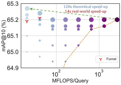
The image is a scatter plot comparing **mAP@10 (%)** (mean Average Precision at 10 results) against **MFLOPS/Query** (millions of floating-point operations per query). It includes two trend lines representing theoretical and real-world speed-up factors, along with annotated data points and a "Funnel" marker.
---
### Components/Axes
- **X-axis**: "MFLOPS/Query" (logarithmic scale: 10² to 10³).
- **Y-axis**: "mAP@10 (%)" (linear scale: 64.9 to 65.3).
- **Legend**:
- **Red "Y"**: Labeled "Funnel" (positioned at the lower-left cluster of data points).
- **Dashed green line**: "128x theoretical speed-up" (top-left to bottom-right).
- **Dotted orange line**: "14x real-world speed-up" (bottom-left to top-right).
---
### Detailed Analysis
1. **Data Points**:
- **Blue dots**: Clustered at lower MFLOPS/Query values (10² to ~10².5), with mAP@10 ranging from 65.0 to 65.2.
- **Purple dots**: Spread across higher MFLOPS/Query values (10².5 to 10³), with mAP@10 between 65.0 and 65.2.
- **Red "Y" markers**: Located at the lowest MFLOPS/Query (10²) and highest mAP@10 (65.2), suggesting a focal point for the "Funnel" model.
2. **Trend Lines**:
- **Green dashed line ("128x theoretical speed-up")**:
- Starts at ~65.3 mAP@10 (10² MFLOPS/Query) and slopes downward to ~65.1 at 10³ MFLOPS/Query.
- Indicates a **theoretical degradation** in performance as computational power increases.
- **Orange dotted line ("14x real-world speed-up")**:
- Begins at ~65.0 mAP@10 (10² MFLOPS/Query) and rises to ~65.2 at 10³ MFLOPS/Query.
- Shows a **real-world improvement** in performance with higher MFLOPS/Query.
3. **Annotations**:
- A green arrow points to the highest mAP@10 value (65.3) at the lowest MFLOPS/Query (10²), emphasizing the theoretical peak.
- The red "Y" marker is explicitly labeled "Funnel," likely representing a specific optimization or benchmark.
---
### Key Observations
- **Theoretical vs. Real-World Divergence**:
The green line (theoretical) predicts a **128x speed-up** but shows a **decline in mAP@10** as MFLOPS/Query increases, while the orange line (real-world) demonstrates a **14x speed-up** with **improving mAP@10**.
- **Funnel Marker**: The red "Y" at (10² MFLOPS/Query, 65.2 mAP@10) may represent an optimal balance between computational efficiency and performance.
- **Data Point Distribution**:
- Lower MFLOPS/Query values (10²) cluster around higher mAP@10 (65.2–65.3).
- Higher MFLOPS/Query values (10³) show a mix of mAP@10 values, suggesting diminishing returns or trade-offs.
---
### Interpretation
The chart highlights a **discrepancy between theoretical and real-world performance gains**. While the "128x theoretical speed-up" line assumes ideal conditions, the "14x real-world speed-up" reflects practical constraints (e.g., algorithmic inefficiencies, hardware limitations). The "Funnel" marker (red "Y") likely signifies a critical threshold where computational resources are optimally allocated to maximize mAP@10. The downward trend of the green line suggests that theoretical models may overestimate performance gains, while the upward orange line underscores the importance of real-world validation. The data implies that increasing MFLOPS/Query does not always linearly improve mAP@10, emphasizing the need for balanced system design.