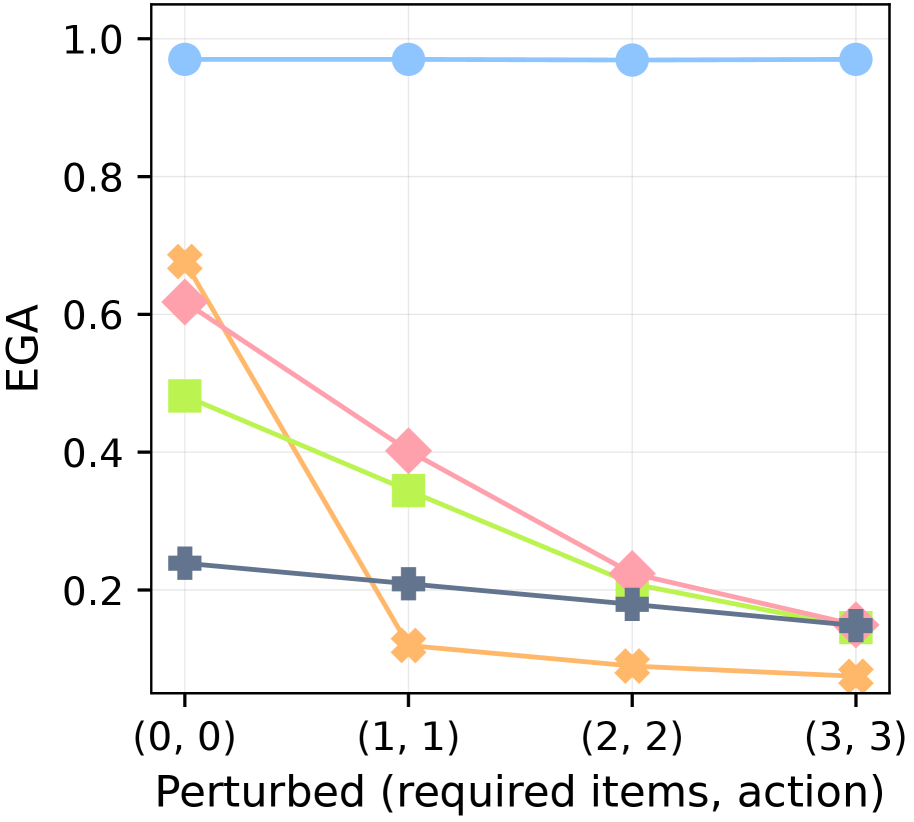
## Line Chart: EGA vs. Perturbed (required items, action)
### Overview
This line chart depicts the relationship between "Perturbed (required items, action)" on the x-axis and "EGA" on the y-axis. The chart displays five distinct lines, each representing a different data series, showing how EGA changes as the perturbation level increases. The x-axis values are (0, 0), (1, 1), (2, 2), and (3, 3). The y-axis ranges from approximately 0.0 to 1.0.
### Components/Axes
* **X-axis Label:** "Perturbed (required items, action)"
* **X-axis Markers:** (0, 0), (1, 1), (2, 2), (3, 3)
* **Y-axis Label:** "EGA"
* **Y-axis Scale:** 0.0 to 1.0, with increments of 0.2.
* **Data Series:** Five lines, each with a unique color and marker.
* Blue Line with Circle Marker
* Pink Line with Diamond Marker
* Green Line with Square Marker
* Brown Line with Triangle Marker
* Black Line with Plus Marker
### Detailed Analysis
Let's analyze each line individually, noting trends and approximate data points.
* **Blue Line:** This line is nearly flat, maintaining a value of approximately 0.95-1.0 throughout all x-axis values.
* (0, 0): ~0.98
* (1, 1): ~0.97
* (2, 2): ~0.96
* (3, 3): ~0.95
* **Pink Line:** This line shows a strong downward trend.
* (0, 0): ~0.68
* (1, 1): ~0.38
* (2, 2): ~0.28
* (3, 3): ~0.18
* **Green Line:** This line also shows a downward trend, but less steep than the pink line.
* (0, 0): ~0.45
* (1, 1): ~0.32
* (2, 2): ~0.22
* (3, 3): ~0.12
* **Brown Line:** This line exhibits a moderate downward trend.
* (0, 0): ~0.55
* (1, 1): ~0.25
* (2, 2): ~0.15
* (3, 3): ~0.10
* **Black Line:** This line is relatively flat, with a slight downward trend.
* (0, 0): ~0.22
* (1, 1): ~0.20
* (2, 2): ~0.18
* (3, 3): ~0.15
### Key Observations
* The blue line remains consistently high, indicating that the corresponding condition is largely unaffected by the perturbation.
* The pink and green lines show the most significant decrease in EGA as the perturbation increases.
* The brown and black lines show a more moderate decrease.
* All lines demonstrate a negative correlation between perturbation and EGA, meaning that as the perturbation increases, EGA tends to decrease.
### Interpretation
The chart suggests that increasing the "Perturbed (required items, action)" level generally leads to a decrease in EGA. The different lines likely represent different conditions or experimental setups, with the blue line representing a condition that is robust to the perturbation. The steep decline in the pink and green lines indicates that these conditions are highly sensitive to the perturbation. The x-axis values (0,0), (1,1), (2,2), (3,3) suggest a paired increase in "required items" and "action" as the perturbation increases. The EGA metric likely represents some measure of performance or effectiveness, and the chart demonstrates how this performance degrades as the system is perturbed. The consistent high value of the blue line suggests a baseline or control condition that is not affected by the perturbation, providing a reference point for evaluating the impact on other conditions. The chart could be used to identify conditions that are most vulnerable to perturbations and to develop strategies for mitigating their impact.