## Causal Diagram: Confounding Structure in Treatment-Outcome Analysis
### Overview
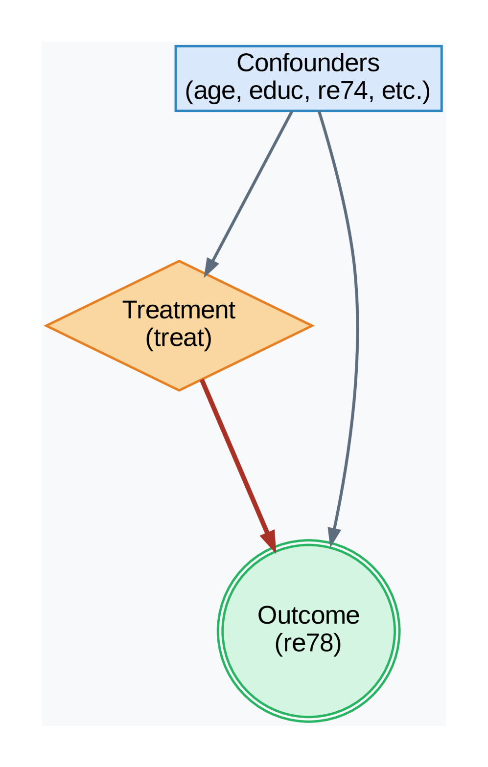
The image is a directed acyclic graph (DAG) illustrating a classic confounding structure in causal inference. It depicts the relationships between a set of confounding variables, a treatment variable, and an outcome variable. The diagram is designed to show how external factors can influence both the treatment assignment and the observed outcome, thereby complicating the estimation of the true causal effect of the treatment.
### Components/Axes
The diagram consists of three primary nodes connected by directional arrows (edges).
1. **Top Node (Confounders):**
* **Shape & Color:** A blue rectangle with a solid border.
* **Label Text:** "Confounders (age, educ, re74, etc.)"
* **Position:** Centered at the top of the diagram.
* **Function:** Represents a set of pre-treatment variables that are potential common causes of both the treatment and the outcome. The listed examples are "age," "educ" (likely education), and "re74" (likely real earnings in 1974).
2. **Middle-Left Node (Treatment):**
* **Shape & Color:** An orange diamond (rhombus) with a solid border.
* **Label Text:** "Treatment (treat)"
* **Position:** Located below and to the left of the Confounders node.
* **Function:** Represents the intervention or exposure variable of interest, labeled "treat."
3. **Bottom-Right Node (Outcome):**
* **Shape & Color:** A light green circle with a double-line border.
* **Label Text:** "Outcome (re78)"
* **Position:** Located below and to the right of the Treatment node, and directly below the Confounders node.
* **Function:** Represents the measured result variable, labeled "re78" (likely real earnings in 1978).
**Arrows (Edges):**
* **From Confounders to Treatment:** A solid gray arrow points from the bottom of the Confounders rectangle to the top corner of the Treatment diamond. This indicates that the confounding variables influence the assignment of the treatment.
* **From Confounders to Outcome:** A solid gray arrow points from the bottom of the Confounders rectangle to the top of the Outcome circle. This indicates that the confounding variables also directly influence the outcome.
* **From Treatment to Outcome:** A solid **red** arrow points from the bottom corner of the Treatment diamond to the left side of the Outcome circle. This represents the direct causal path of interest—the effect of the treatment on the outcome.
### Detailed Analysis
The diagram explicitly maps the flow of influence:
1. **Confounders → Treatment:** The gray arrow establishes that variables like age, education, and prior earnings affect who receives the treatment. This is a source of selection bias.
2. **Confounders → Outcome:** The second gray arrow shows these same variables also affect the outcome (e.g., earnings in 1978) independently of the treatment.
3. **Treatment → Outcome:** The red arrow highlights the primary causal relationship under study. However, its effect is "confounded" by the two gray paths originating from the Confounders node.
The use of distinct shapes (rectangle, diamond, circle) and colors (blue, orange, green) visually separates the three types of variables. The red color of the Treatment→Outcome arrow emphasizes it as the focal relationship.
### Key Observations
* **Classic Backdoor Path:** The diagram visually defines a "backdoor path" from Treatment to Outcome via the Confounders: Treatment ← Confounders → Outcome. This open path creates a non-causal association between treatment and outcome.
* **Visual Emphasis:** The red arrow draws the viewer's eye to the direct causal effect, while the gray arrows represent the confounding bias that must be controlled for in analysis.
* **Variable Naming:** The labels "re74" and "re78" strongly suggest this diagram is based on a well-known econometric dataset (likely the Lalonde dataset) studying the effect of a job training program ("treat") on subsequent earnings ("re78"), with prior earnings ("re74") and demographics as confounders.
### Interpretation
This diagram is a foundational tool in causal inference, particularly for observational studies. It argues that a naive comparison of outcomes between treated and untreated groups would be biased because the groups differ systematically in their confounding characteristics (age, education, prior earnings).
The diagram dictates the analytical strategy: to estimate the true causal effect of "treat" on "re78," one must "block" the backdoor path. This is achieved by statistically **controlling for** (adjusting for) the variables in the "Confounders" set. Methods like regression adjustment, matching, or stratification aim to create a comparison where the confounders are balanced across treatment groups, effectively severing the gray arrows and isolating the red causal path.
In essence, the image is not just a flowchart but a **causal model** that encodes assumptions about the data-generating process. It visually justifies the need for specific statistical controls and warns against interpreting raw associations as causal effects.