\n
## Diagram: Causal Relationship Model
### Overview
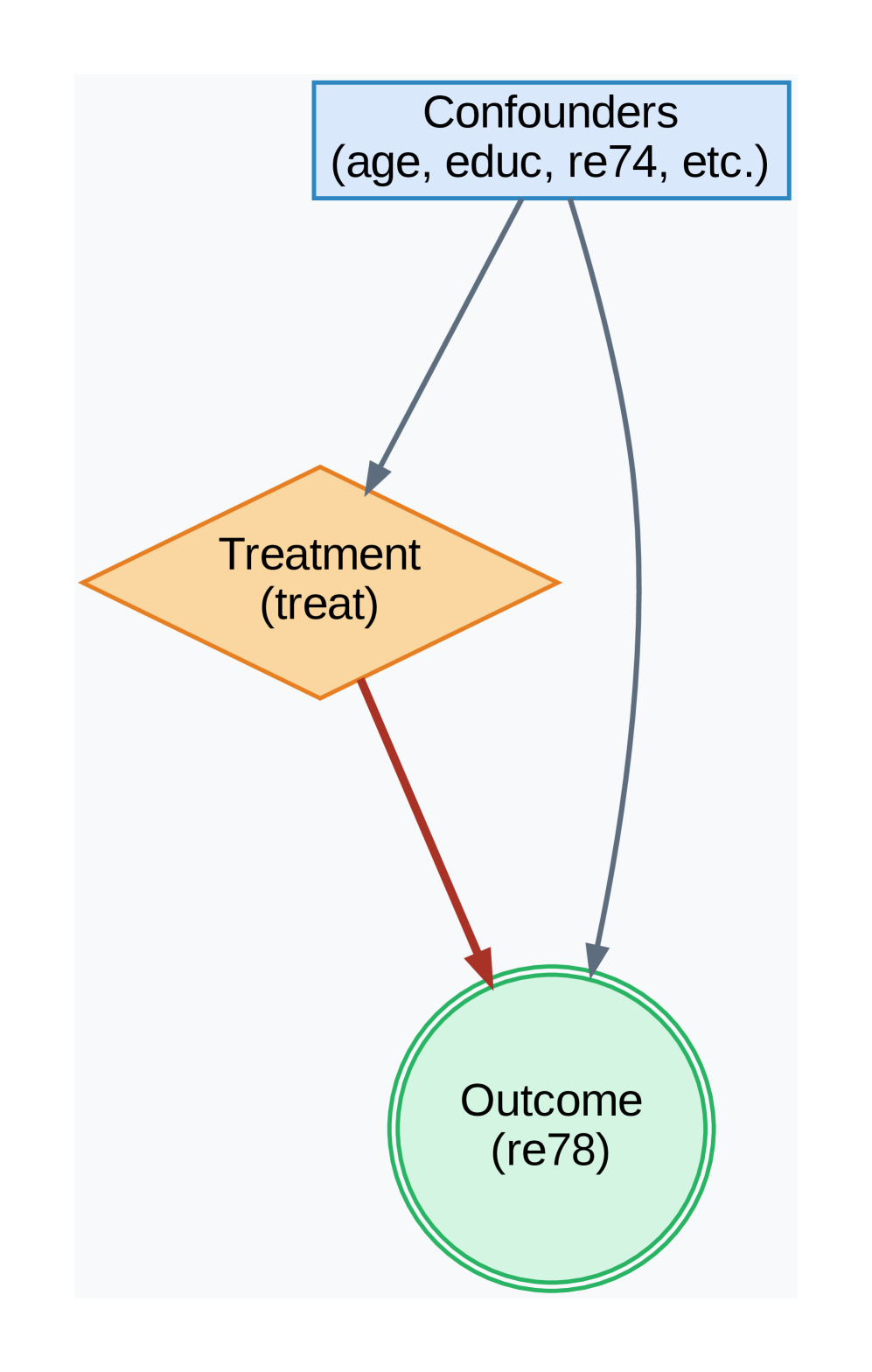
The image depicts a causal diagram illustrating the relationship between confounders, treatment, and outcome. It uses shapes and arrows to represent these elements and their connections. The diagram suggests a potential causal pathway with a direct effect of treatment on outcome, and the influence of confounders on both treatment and outcome.
### Components/Axes
The diagram consists of three main components:
* **Confounders:** Represented by a rectangular box at the top-center of the image. Labeled "Confounders (age, educ, re74, etc.)".
* **Treatment:** Represented by a diamond shape in the center of the image. Labeled "Treatment (treat)".
* **Outcome:** Represented by a circular shape at the bottom-center of the image. Labeled "Outcome (re78)".
Arrows connect these components, indicating the direction of influence. There are two arrow colors: blue and red.
### Detailed Analysis or Content Details
* **Confounders to Treatment:** A blue arrow originates from the "Confounders" box and points towards the "Treatment" diamond.
* **Confounders to Outcome:** A blue arrow originates from the "Confounders" box and points towards the "Outcome" circle.
* **Treatment to Outcome:** A red arrow originates from the "Treatment" diamond and points towards the "Outcome" circle.
The diagram does not contain numerical data or scales. It is a qualitative representation of relationships.
### Key Observations
The diagram highlights that the outcome is influenced by both the treatment and the confounders. The confounders influence both the treatment and the outcome, suggesting a potential for confounding bias. The use of different arrow colors (blue and red) may indicate different strengths or types of relationships, but this is not explicitly stated.
### Interpretation
This diagram illustrates a common scenario in causal inference. The "Confounders" represent variables that are associated with both the "Treatment" and the "Outcome," potentially distorting the observed relationship between them. The diagram suggests that to accurately estimate the effect of the "Treatment" on the "Outcome," it is necessary to control for these "Confounders." The red arrow from "Treatment" to "Outcome" represents the causal effect of interest, while the blue arrows represent potential sources of bias. The diagram is a simplified representation of a complex causal system and does not specify the nature of the relationships between the variables. It is a conceptual model used to guide research and analysis. The labels "age, educ, re74, etc." suggest that the confounders are demographic or socioeconomic variables. "treat" and "re78" are likely variable names used in a specific study or dataset.