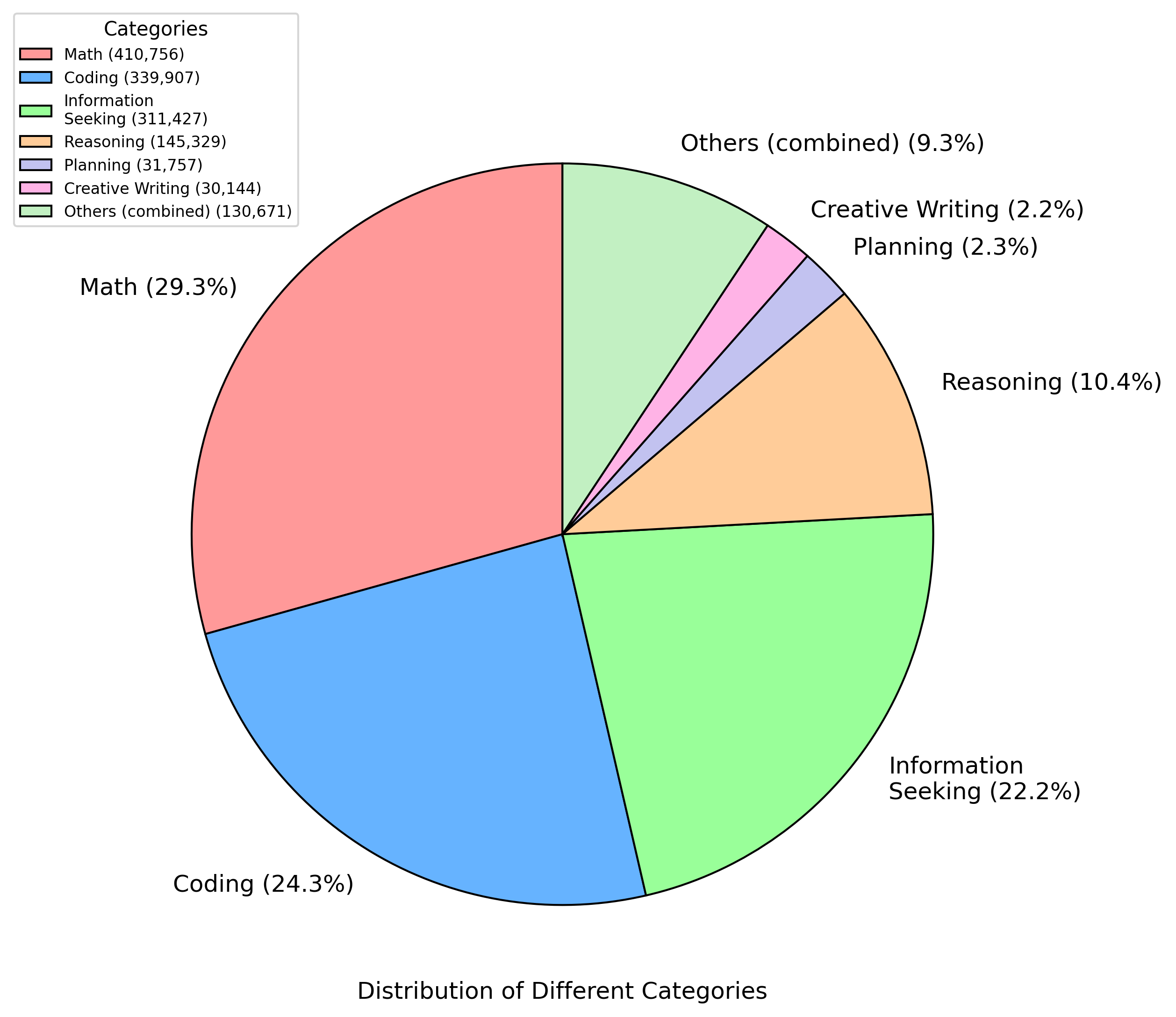
## Chart Type: Pie Chart
### Overview
The image is a pie chart illustrating the distribution of different categories. The chart shows the percentage and absolute value for each category.
### Components/Axes
* **Title:** Distribution of Different Categories
* **Legend (Top-Left):**
* Math (410,756) - Light Red
* Coding (339,907) - Light Blue
* Information Seeking (311,427) - Light Green
* Reasoning (145,329) - Light Orange
* Planning (31,757) - Light Purple
* Creative Writing (30,144) - Light Pink
* Others (combined) (130,671) - Light Green
### Detailed Analysis
The pie chart is divided into seven segments, each representing a category. The percentage and absolute value for each category are as follows:
* **Math:** 29.3% (410,756) - Light Red
* **Coding:** 24.3% (339,907) - Light Blue
* **Information Seeking:** 22.2% (311,427) - Light Green
* **Reasoning:** 10.4% (145,329) - Light Orange
* **Others (combined):** 9.3% (130,671) - Light Green
* **Planning:** 2.3% (31,757) - Light Purple
* **Creative Writing:** 2.2% (30,144) - Light Pink
### Key Observations
* Math constitutes the largest portion of the distribution at 29.3%.
* Coding and Information Seeking are also significant, with 24.3% and 22.2% respectively.
* Planning and Creative Writing have the smallest shares, at 2.3% and 2.2% respectively.
* "Others (combined)" represents a notable portion at 9.3%.
### Interpretation
The pie chart provides a clear visual representation of the relative proportions of different categories within a dataset. The data suggests that Math, Coding, and Information Seeking are the most prevalent categories, while Planning and Creative Writing are less common. The "Others (combined)" category indicates that there are other, less significant categories that have been grouped together. The chart is useful for quickly understanding the distribution and relative importance of each category.