\n
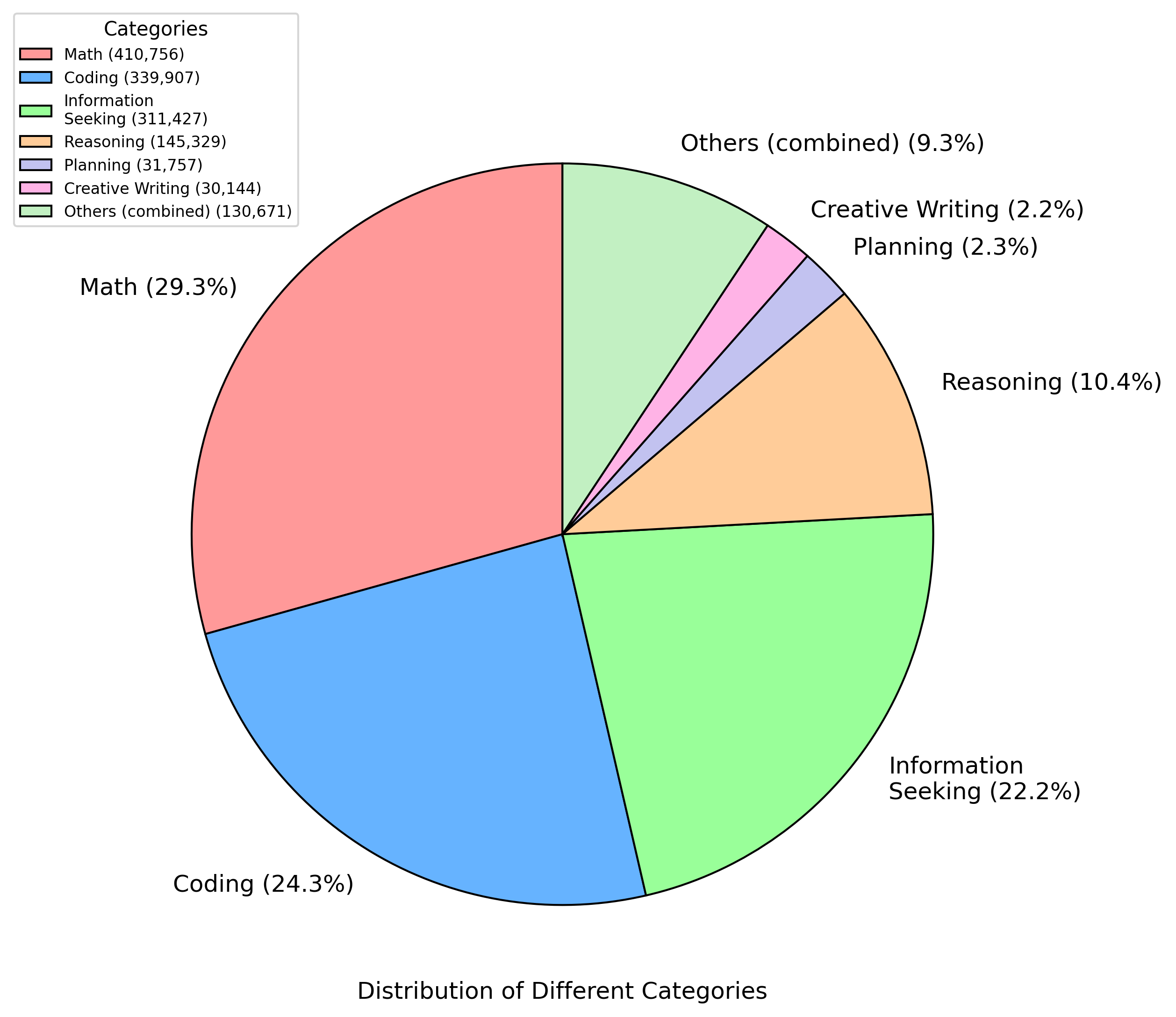
## Pie Chart: Distribution of Different Categories
### Overview
This image presents a pie chart illustrating the distribution of different categories, likely representing time spent or frequency of activities. The chart is visually divided into segments, each corresponding to a specific category, with the size of each segment proportional to its percentage of the whole. A legend is positioned in the top-left corner, providing color-coding for each category.
### Components/Axes
* **Title:** "Distribution of Different Categories" (located at the bottom center)
* **Legend:** Located in the top-left corner, listing the following categories with their corresponding colors and numerical values (likely counts):
* Math: (410,756) - Red
* Coding: (339,907) - Blue
* Information Seeking: (311,427) - Light Blue
* Reasoning: (145,329) - Yellow
* Planning: (31,757) - Pink
* Creative Writing: (30,144) - Purple
* Others (combined): (130,671) - Green
* **Pie Segments:** Each segment represents a category, with the size of the segment corresponding to its percentage.
### Detailed Analysis
The pie chart displays the following approximate percentages and corresponding values:
* **Math:** 29.3% (410,756) - Represented by a large red segment, occupying a significant portion of the pie, starting from the top and moving clockwise.
* **Coding:** 24.3% (339,907) - Represented by a large blue segment, following Math clockwise.
* **Information Seeking:** 22.2% (311,427) - Represented by a light blue segment, following Coding clockwise.
* **Reasoning:** 10.4% (145,329) - Represented by a yellow segment, following Information Seeking clockwise.
* **Others (combined):** 9.3% (130,671) - Represented by a green segment, following Reasoning clockwise.
* **Planning:** 2.3% (31,757) - Represented by a small pink segment, following Others clockwise.
* **Creative Writing:** 2.2% (30,144) - Represented by a small purple segment, following Planning clockwise.
The segments are arranged clockwise, starting with Math at the top. The visual trend shows a decreasing segment size as we move clockwise from Math to Creative Writing.
### Key Observations
* Math, Coding, and Information Seeking constitute the largest portions of the distribution, accounting for approximately 75.8% of the total.
* Planning and Creative Writing represent the smallest portions, each contributing less than 3% to the overall distribution.
* The "Others" category, while not negligible, is significantly smaller than the primary categories.
### Interpretation
The data suggests a strong focus on technical and analytical activities (Math, Coding, Information Seeking). The relatively large proportion dedicated to Reasoning indicates a significant amount of problem-solving or critical thinking. The smaller proportions for Planning and Creative Writing suggest these activities are less frequent or consume less time compared to the others. The combined "Others" category suggests a variety of less dominant activities.
The chart provides a snapshot of the distribution of activities, potentially representing how an individual or group allocates their time or resources. The dominance of technical categories could indicate a professional or educational context focused on STEM fields. The data could be used to identify areas where time allocation might be adjusted or optimized. The inclusion of a combined "Others" category suggests that a more granular breakdown of these activities might be beneficial for a deeper understanding.