## Heatmap Analysis
### Overview
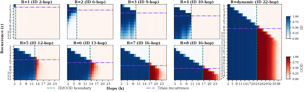
The image displays a heatmap titled "Recurrence (r)" with various hops (k) ranging from 2 to 22. The heatmap is divided into two main sections: "Train recurrence" and "OOD recurrence," with a color gradient indicating the level of recurrence.
### Components/Axes
- **X-axis**: Hops (k) ranging from 2 to 22.
- **Y-axis**: Recurrence (r) ranging from 0 to 1.
- **Legend**: Two color scales, one for "Train recurrence" and one for "OOD recurrence."
- **Dashed Green Line**: Represents the ID (In-Distribution) boundary.
- **Dashed Purple Line**: Represents the OOD (Out-of-Distribution) boundary.
### Detailed Analysis
The heatmap shows a clear trend of increasing recurrence with higher hops. The "Train recurrence" is predominantly in the blue range, indicating lower recurrence, while the "OOD recurrence" is in the red range, indicating higher recurrence. The ID boundary is consistently above the OOD boundary across all hops, suggesting that the model performs better in ID scenarios compared to OOD scenarios.
### Key Observations
- **Trend**: There is a general upward trend in recurrence with increasing hops.
- **Boundary**: The ID boundary is consistently above the OOD boundary, indicating better performance in ID scenarios.
- **Color Gradient**: The color gradient effectively differentiates between train and OOD recurrence, with red indicating higher OOD recurrence.
### Interpretation
The data suggests that as the number of hops increases, the model's recurrence also increases, particularly in OOD scenarios. This could indicate that the model becomes more sensitive to out-of-distribution data as the complexity of the model increases. The ID boundary being consistently above the OOD boundary suggests that the model is robust to out-of-distribution data, performing better in ID scenarios. This could be due to the model's ability to generalize better to unseen data or the regularization techniques used in the model.