## Dual-Axis Line Chart: Training Metrics (R² Value vs. Information Gain)
### Overview
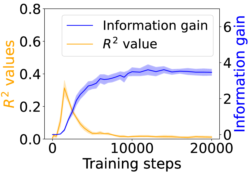
The image displays a dual-axis line chart plotting two different metrics against the number of training steps. The chart compares the progression of an "R² value" (left y-axis) and "Information gain" (right y-axis) over the course of 20,000 training steps. The data suggests a relationship where one metric peaks early and declines while the other shows sustained improvement.
### Components/Axes
* **X-Axis (Bottom):**
* **Label:** "Training steps"
* **Scale:** Linear scale from 0 to 20,000.
* **Major Tick Marks:** 0, 10000, 20000.
* **Primary Y-Axis (Left):**
* **Label:** "R² values" (text color: orange).
* **Scale:** Linear scale from 0.0 to 0.8.
* **Major Tick Marks:** 0.0, 0.2, 0.4, 0.6, 0.8.
* **Secondary Y-Axis (Right):**
* **Label:** "Information gain" (text color: blue).
* **Scale:** Linear scale from 0 to 6.
* **Major Tick Marks:** 0, 2, 4, 6.
* **Legend (Top-Left Corner):**
* A blue line segment is labeled "Information gain".
* An orange line segment is labeled "R² value".
* **Data Series:**
1. **Blue Line ("Information gain"):** A solid blue line with a semi-transparent blue shaded area around it, likely representing a confidence interval or standard deviation.
2. **Orange Line ("R² value"):** A solid orange line with a semi-transparent orange shaded area around it.
### Detailed Analysis
**1. "Information gain" (Blue Line, Right Y-Axis):**
* **Trend Verification:** The line shows a steep, positive slope initially, followed by a gradual plateau.
* **Data Points (Approximate):**
* Starts near 0 at step 0.
* Rises sharply, crossing a value of ~2 by step 2500.
* Continues to increase, reaching ~3.5 by step 5000.
* The growth rate slows. It reaches approximately 4.0 by step 10,000.
* From step 10,000 to 20,000, the line fluctuates slightly but remains stable around a value of 4.0 (±0.2).
* **Shaded Area:** The blue shaded region is narrow at the start, widens during the period of rapid increase (steps 2500-7500), and remains moderately wide during the plateau phase, indicating some variance in the metric across runs or measurements.
**2. "R² value" (Orange Line, Left Y-Axis):**
* **Trend Verification:** The line shows a sharp, early peak followed by a rapid decline and a long tail near zero.
* **Data Points (Approximate):**
* Starts near 0 at step 0.
* Peaks sharply at approximately 0.35 around step 2500.
* Declines rapidly after the peak, falling to ~0.1 by step 5000.
* Continues a slower decline, approaching ~0.02 by step 10,000.
* From step 10,000 to 20,000, it remains very low, hovering just above 0.0 (approximately 0.01-0.02).
* **Shaded Area:** The orange shaded region is most prominent around the peak (step 2500), suggesting higher variance at the point of maximum R² value. It narrows significantly as the value approaches zero.
### Key Observations
1. **Inverse Relationship Post-Peak:** After approximately step 2500, the two metrics exhibit a strong inverse relationship. As "Information gain" continues to climb and stabilize, the "R² value" collapses.
2. **Divergent End States:** By the end of training (20,000 steps), "Information gain" is high and stable (~4.0), while "R² value" is negligible (~0.01).
3. **Critical Early Phase:** The most dynamic changes for both metrics occur in the first quarter of the displayed training (0-5000 steps).
4. **Variance Patterns:** The uncertainty (shaded area) for both metrics is greatest during their periods of most rapid change.
### Interpretation
This chart likely visualizes the training dynamics of a machine learning model, possibly in a reinforcement learning or representation learning context.
* **What the data suggests:** The "R² value" (a measure of how well a model explains variance in data) peaks very early and then deteriorates. This could indicate that the model quickly fits superficial patterns in the initial data but then moves away from that solution. Conversely, "Information gain" (a measure of how much the model's predictions reduce uncertainty) shows sustained improvement, suggesting the model is continually learning more useful or generalizable information about its environment or task, even as its simple explanatory power (R²) for a specific target diminishes.
* **Relationship between elements:** The inverse trend post-peak is the most critical feature. It implies a trade-off or a shift in the model's learning objective. The model may be sacrificing simple curve-fitting (high R²) for a more complex, information-rich representation that is better for its ultimate goal (high Information gain).
* **Notable anomaly:** The sharp, isolated peak in R² is unusual. It suggests a very specific, short-lived phase in training where the model's parameters aligned perfectly with a simplistic explanatory model before diverging.
* **Underlying meaning:** This pattern is characteristic of models that undergo a phase transition in learning. The early peak might represent memorization or fitting noise, while the subsequent rise in information gain represents the acquisition of robust, generalizable knowledge. The chart argues that optimizing for R² alone would have stopped training at the wrong point (step ~2500), whereas the true learning progress is captured by the Information gain metric.