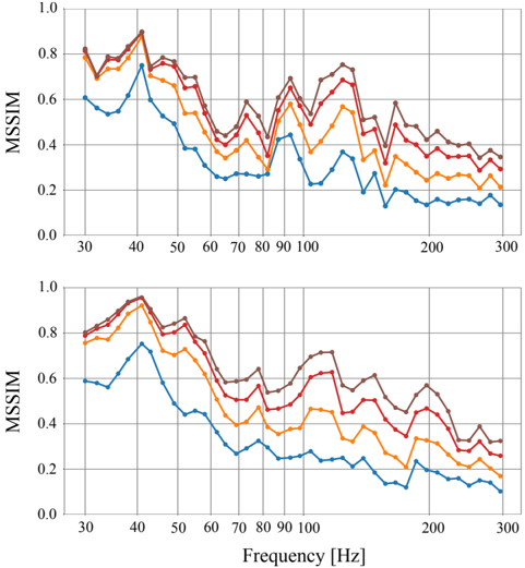
## Line Chart: MSSIM vs Frequency (Hz)
### Overview
The image contains two subplots (top and bottom) displaying line charts of MSSIM (Mean Structural Similarity Index) values across a frequency range of 30 Hz to 300 Hz. Each subplot contains four distinct data series (lines) with varying trends, represented by different colors. The charts include grid lines, axis labels, and a legend on the right side.
### Components/Axes
- **X-axis**: Labeled "Frequency (Hz)" with tick marks at 30, 40, 50, ..., 300 Hz.
- **Y-axis**: Labeled "MSSIM" with values ranging from 0.0 to 1.0 in increments of 0.2.
- **Legend**: Located on the right side of both subplots. Colors correspond to four data series:
- **Blue**: Line 1
- **Red**: Line 2
- **Yellow**: Line 3
- **Brown**: Line 4
- **Grid Lines**: Vertical and horizontal lines at each tick mark for alignment.
### Detailed Analysis
#### Top Subplot
- **Line 1 (Blue)**:
- Starts at ~0.8 at 30 Hz, dips to ~0.6 at 40 Hz, then fluctuates between ~0.4 and ~0.8 up to 300 Hz.
- Notable peak at ~0.85 near 50 Hz.
- **Line 2 (Red)**:
- Begins at ~0.75 at 30 Hz, rises to ~0.9 at 40 Hz, then declines to ~0.5 by 100 Hz, with minor fluctuations.
- Sharp drop to ~0.3 near 200 Hz.
- **Line 3 (Yellow)**:
- Starts at ~0.7 at 30 Hz, peaks at ~0.85 near 50 Hz, then declines to ~0.4 by 100 Hz, with oscillations.
- Reaches ~0.2 near 300 Hz.
- **Line 4 (Brown)**:
- Begins at ~0.8 at 30 Hz, decreases steadily to ~0.4 by 100 Hz, then stabilizes around ~0.3–0.4.
#### Bottom Subplot
- **Line 1 (Blue)**:
- Starts at ~0.6 at 30 Hz, drops to ~0.4 at 40 Hz, then fluctuates between ~0.2 and ~0.6 up to 300 Hz.
- Sharp dip to ~0.1 near 200 Hz.
- **Line 2 (Red)**:
- Begins at ~0.7 at 30 Hz, rises to ~0.85 at 40 Hz, then declines to ~0.5 by 100 Hz, with minor fluctuations.
- Sharp drop to ~0.3 near 200 Hz.
- **Line 3 (Yellow)**:
- Starts at ~0.65 at 30 Hz, peaks at ~0.8 at 50 Hz, then declines to ~0.4 by 100 Hz, with oscillations.
- Reaches ~0.2 near 300 Hz.
- **Line 4 (Brown)**:
- Begins at ~0.75 at 30 Hz, decreases steadily to ~0.4 by 100 Hz, then stabilizes around ~0.3–0.4.
### Key Observations
1. **Peaks and Troughs**:
- All lines exhibit peaks near 40–50 Hz, suggesting a potential optimal frequency range for MSSIM.
- Sharp declines occur near 100–200 Hz, indicating reduced similarity at higher frequencies.
2. **Line Behavior**:
- Lines 1 and 2 (blue and red) show more pronounced fluctuations compared to Lines 3 and 4 (yellow and brown).
- Line 4 (brown) in both subplots maintains a relatively stable decline after 100 Hz.
3. **Overlap**:
- Lines overlap significantly in the 30–100 Hz range, making precise value extraction challenging without additional data.
### Interpretation
The charts likely represent MSSIM performance under different conditions (e.g., image processing algorithms, noise levels, or resolution settings). The consistent peaks near 40–50 Hz suggest this frequency range is critical for structural similarity. The sharp declines at higher frequencies (100–300 Hz) may indicate limitations in capturing high-frequency details. The overlapping trends imply that the data series share similar underlying patterns, but their distinct behaviors (e.g., Line 1’s sustained fluctuations vs. Line 4’s stability) could reflect differences in parameters or experimental conditions.
**Note**: Exact numerical values are approximated due to overlapping lines and lack of precise annotations. The legend labels (e.g., "Line 1") are inferred from color coding, as the original labels are not visible in the image.