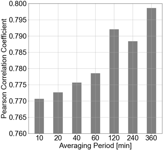
## Bar Chart: Pearson Correlation Coefficient vs. Averaging Period
### Overview
The image displays a vertical bar chart illustrating the relationship between the Pearson Correlation Coefficient and different averaging periods measured in minutes. The chart shows a general positive trend, where the correlation coefficient increases as the averaging period lengthens.
### Components/Axes
* **Chart Type:** Vertical Bar Chart.
* **Y-Axis (Vertical):**
* **Label:** "Pearson Correlation Coefficient"
* **Scale:** Linear scale ranging from 0.760 to 0.800, with major gridlines at intervals of 0.005 (0.760, 0.765, 0.770, 0.775, 0.780, 0.785, 0.790, 0.795, 0.800).
* **X-Axis (Horizontal):**
* **Label:** "Averaging Period [min]"
* **Categories:** Seven discrete time periods: 10, 20, 40, 60, 120, 240, and 360 minutes.
* **Data Series:** A single series represented by seven gray bars, one for each averaging period.
* **Legend:** No separate legend is present; the single data series is directly labeled by the X-axis categories.
* **Grid:** A light gray grid is present in the background, aligned with the Y-axis major ticks.
### Detailed Analysis
The height of each bar represents the Pearson Correlation Coefficient for the corresponding averaging period. The following values are approximate readings from the chart:
| Averaging Period (min) | Approximate Pearson Correlation Coefficient | Visual Trend Description |
| :--- | :--- | :--- |
| 10 | ~0.771 | The shortest period has the lowest correlation. |
| 20 | ~0.773 | Slight increase from the 10-minute period. |
| 40 | ~0.776 | Continued moderate increase. |
| 60 | ~0.778 | Further increase, approaching 0.780. |
| 120 | ~0.792 | A significant jump, surpassing 0.790. |
| 240 | ~0.788 | A noticeable decrease from the 120-minute peak. |
| 360 | ~0.798 | The highest correlation, approaching 0.800. |
**Trend Verification:** The overall visual trend is upward-sloping from left to right (10 min to 360 min), indicating a positive relationship between averaging period length and correlation strength. The trend is not perfectly monotonic, as there is a clear dip at the 240-minute period before rising to the maximum at 360 minutes.
### Key Observations
1. **Positive Correlation with Time:** The primary observation is that longer averaging periods are associated with higher Pearson correlation coefficients.
2. **Non-Linear Increase:** The increase is not linear. The gains are modest between 10 and 60 minutes, followed by a sharp increase at 120 minutes.
3. **Anomaly at 240 Minutes:** The bar for 240 minutes is shorter than the bar for 120 minutes, breaking the otherwise consistent upward trend. This is the most notable outlier in the pattern.
4. **Peak Value:** The maximum correlation (~0.798) is achieved at the longest measured period of 360 minutes (6 hours).
### Interpretation
The data suggests that the strength of the linear relationship (measured by Pearson's r) between the two variables being studied increases when data is averaged over longer time windows. This could imply that short-term noise or fluctuations are smoothed out with longer averaging, revealing a stronger underlying correlation.
The dip at 240 minutes is intriguing. It may indicate a specific temporal scale (4 hours) where the relationship weakens, possibly due to cyclical patterns, data sampling artifacts, or a genuine change in the system's behavior at that interval. Without additional context on what is being correlated, it's difficult to ascertain the cause.
The chart effectively communicates that the choice of temporal scale (averaging period) significantly impacts the measured correlation. The highest correlation is not found at the shortest or a mid-range period, but at the longest period tested (6 hours), suggesting the relationship is most stable or pronounced over longer durations.